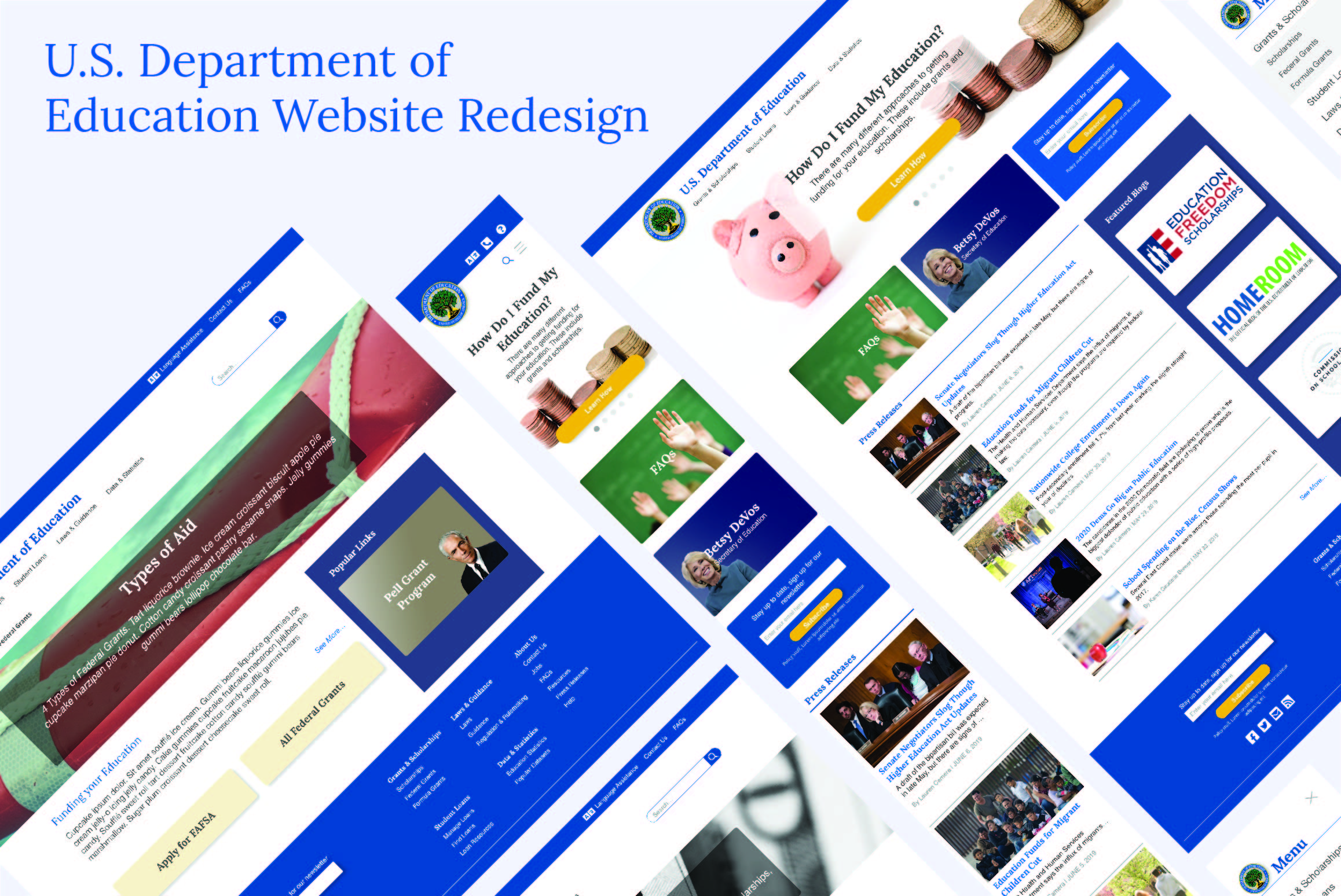
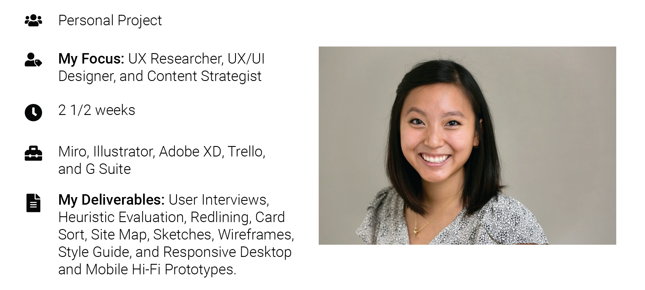
The U.S. Department of Education Website Redesign
The U.S. Department of Education (DoED) is an organization whose mission is to promote student achievement and preparation for global competitiveness. In this personal project, I redesign their website to match the mental model of a student.
PROBLEM
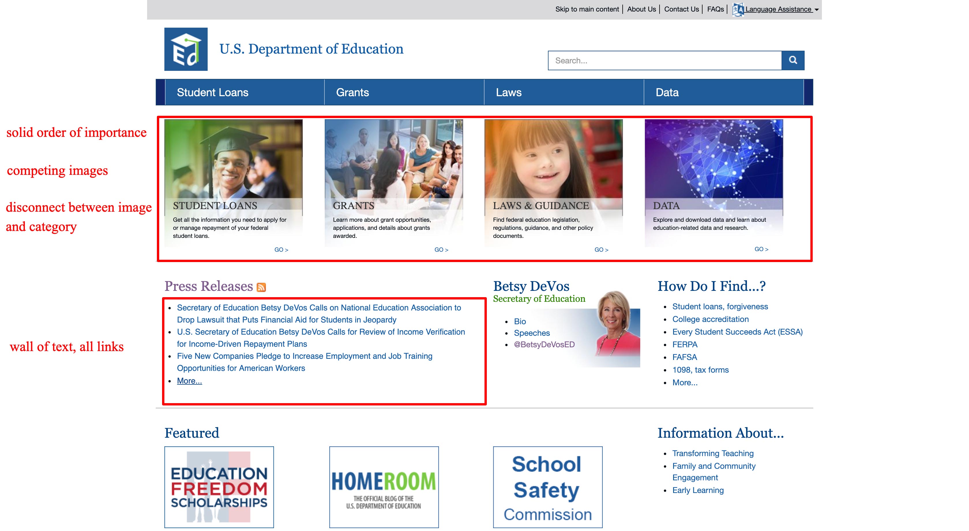
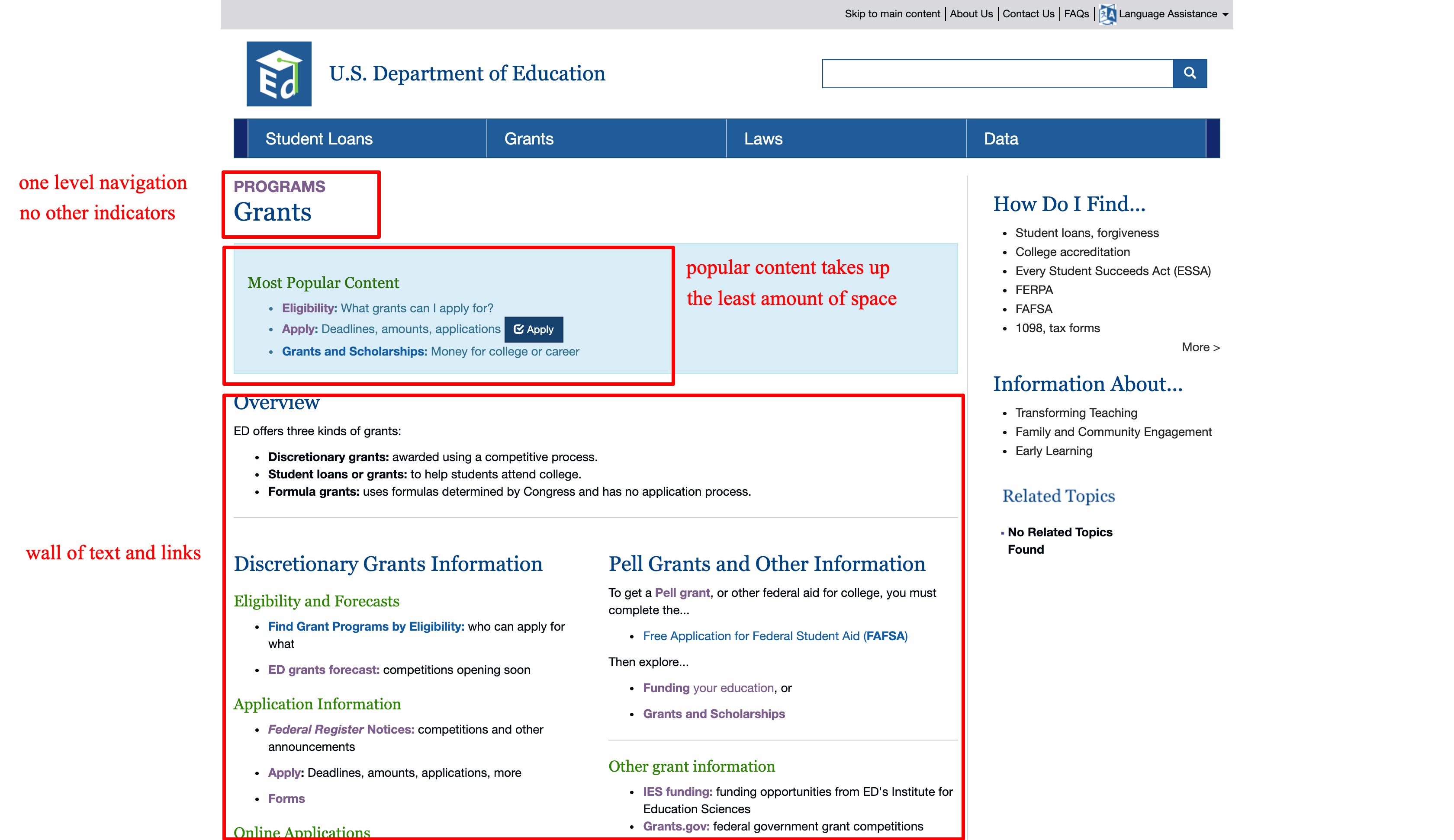
The DoED site as-is has a lot of information but no centralized area of focus. The goal is to redesign this website so that it's easier to use and to give their branding a refresh.
SOLUTION
In this redesign, I chose to focus on a student looking to lower the cost of their tuition as a starting point. From this, I created a roadmap to help students get to the aid they need. Most of the work was in restructuring the content and messaging of the site to fit a student's mental model.
RESEARCH
I learned that students are overwhelmed while searching for grants and scholarships on the DoED’s website. With the data collected from my user interviews, these are the insights I gathered:
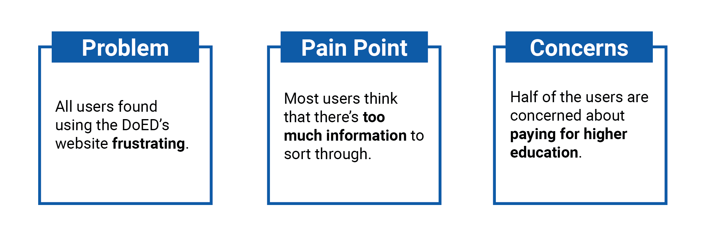
From my own research, I could understand why students were frustrated with finding grants applicable to them. There's a lack of focus and way too much information.
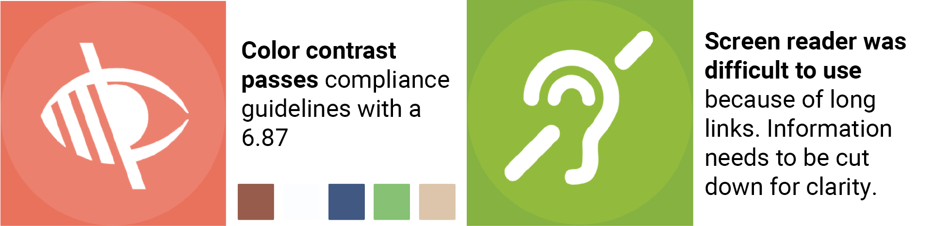
Additionally, I looked into accessibility. This is even more important since the DoED’s mission is to give equal access to students. The colors themselves contrast enough for readability but the screen reader needs work.
DEFINITION
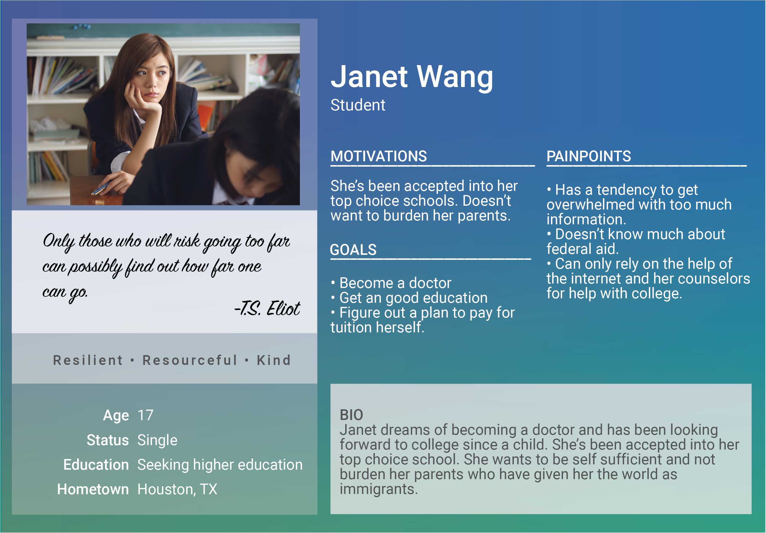
In the next step of the design process, I created documents that help keep me aligned to the goals set with consideration to the insights collected. One item being the user persona, which helped me empathize with the user.
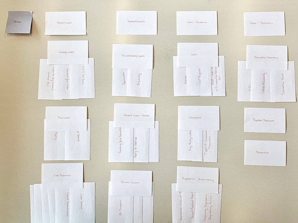
Card Sorting was necessary to sort through all the information housed on DoED. It helped give me clarity in organizing the contents of the site and cutting down on redundant links.
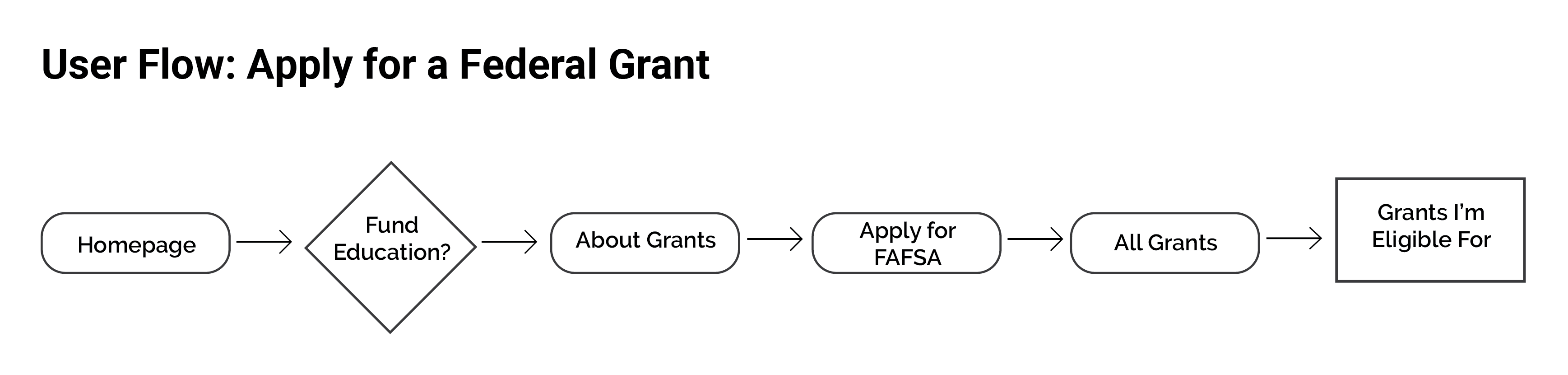
I wanted to give students a roadmap to find funding for their tuition. This was accomplished with a user flow that specifically helps with applying for federal grants.
ITERATION
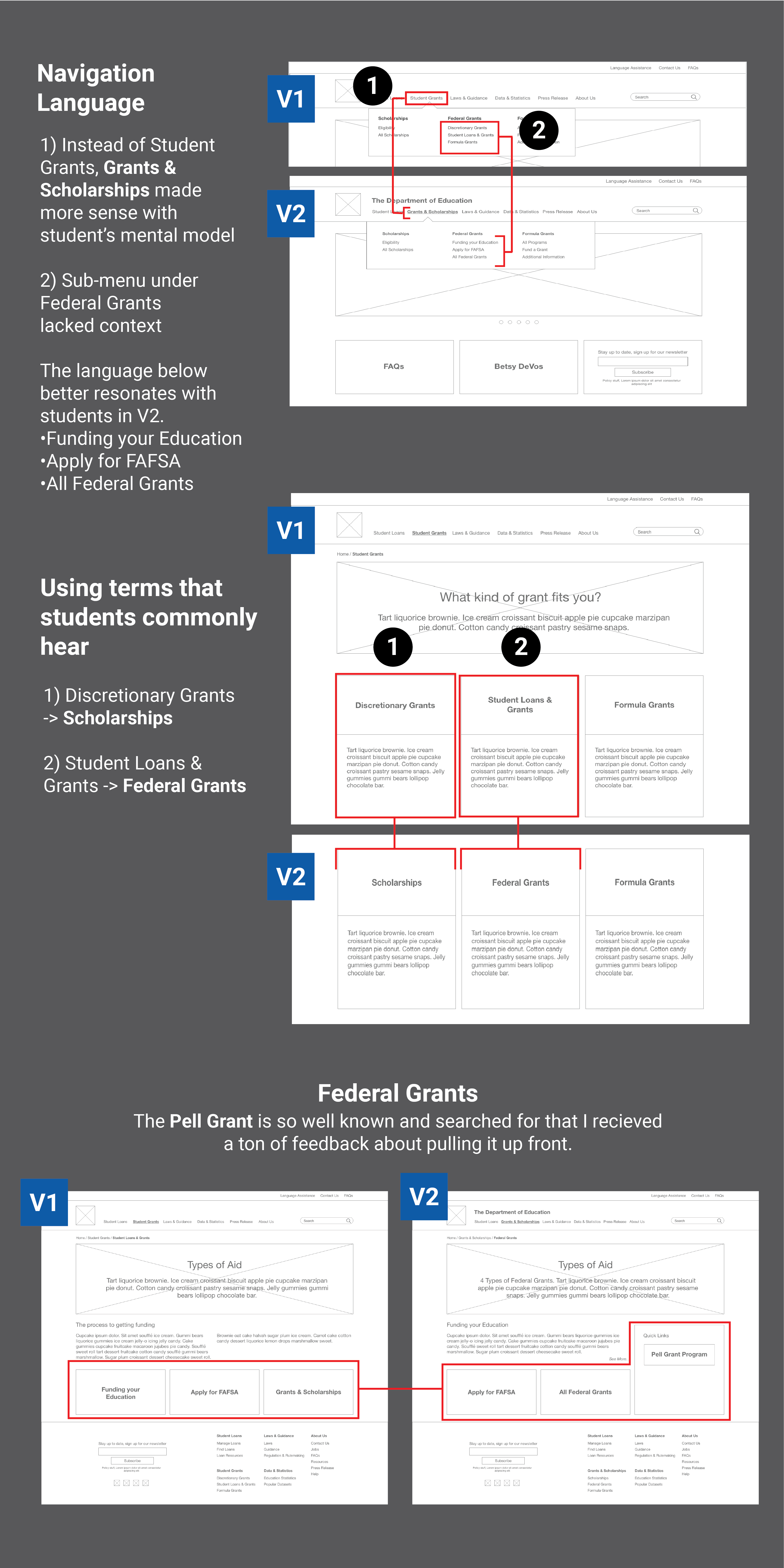
I put some wireframes together and conducted a 5 second test. These quick test helped identify mental disconnects with a student. The biggest changes were made in the dropdown, sub-level navigation, and highlighting the Pell Grant.
Style Guide
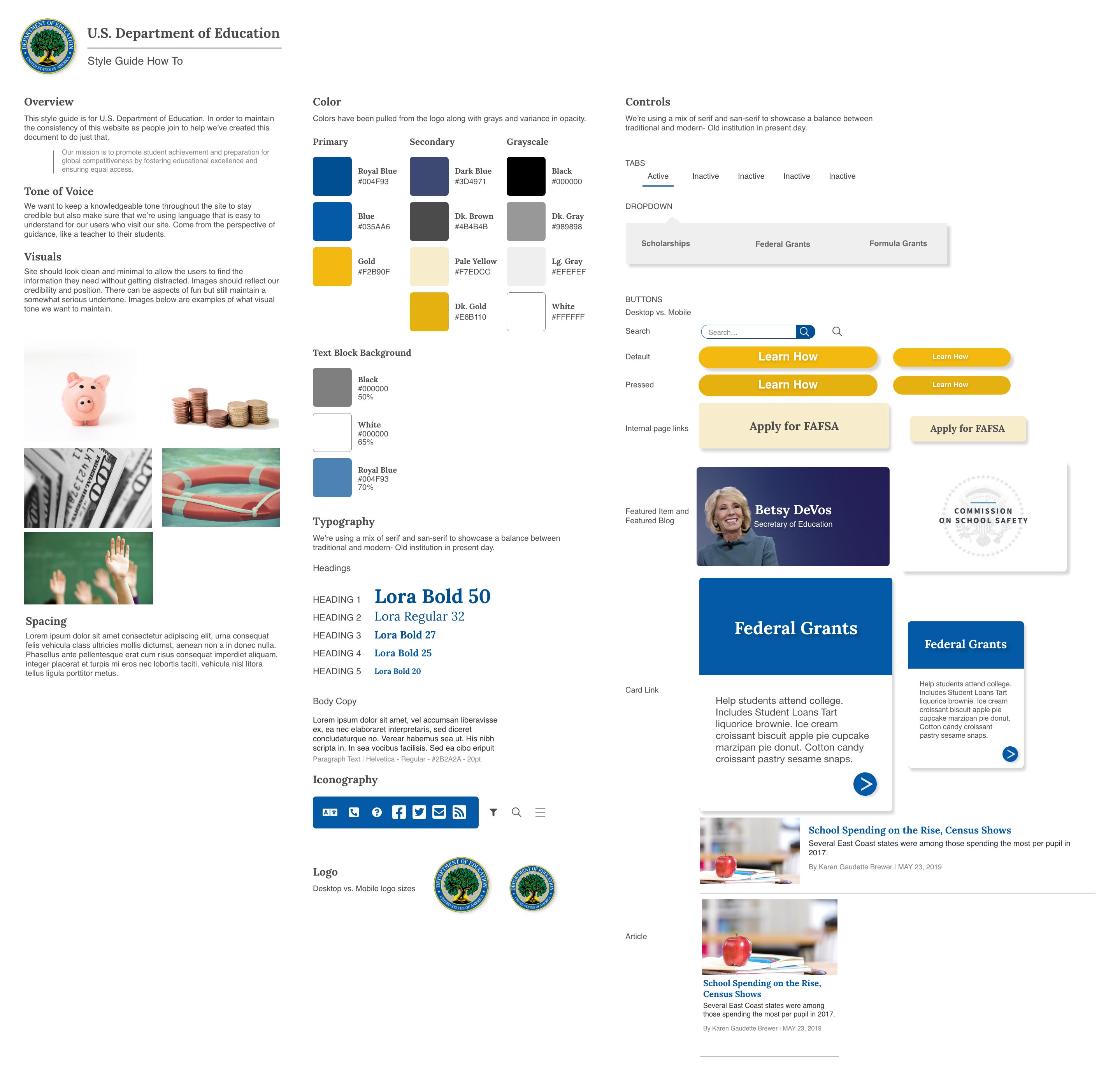
Colors were pulled from the logo to create a simple color pallet for the style guide. I wanted to keep screens clean and have images that convey proper imagery that's serious yet playful.
Iterating over Hi-Fi
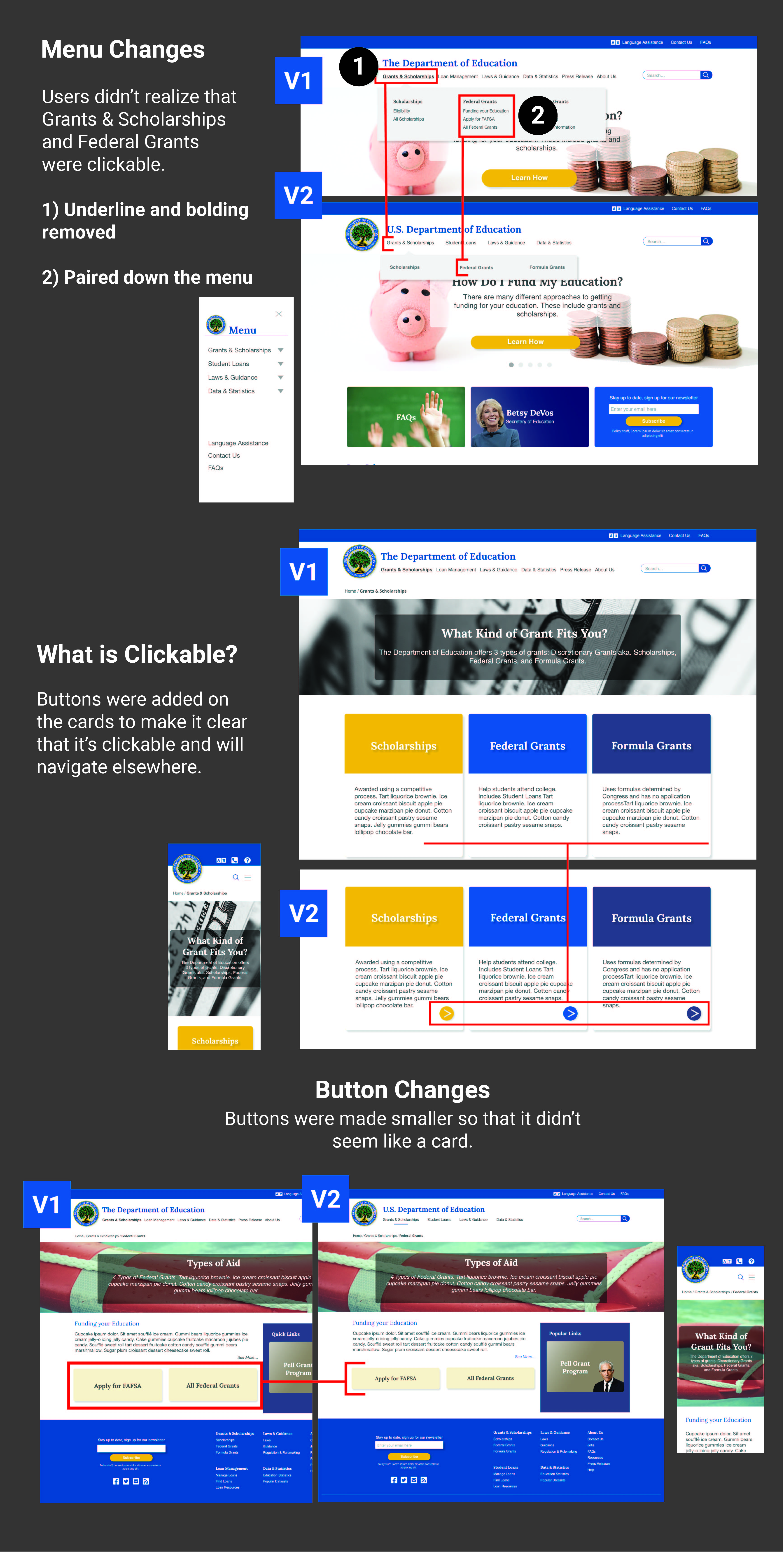
Users had no issues navigating to where they wanted to go. What was surprising was just the concept of what is clickable and what wasn't. Below are the changes made.
RESULT
 View Desktop Prototype
View Mobile Prototype
View Desktop Prototype
View Mobile Prototype
Final Thoughts
- This redesign was successful. It sets the DoED up for better alignment with their organizational goals that will ultimately impact future funding.
- From this project, I was surprised by the confusion on what is clickable and what isn't. It's humbling to see confusion when I percieved an action as obvious. I learned that I was too close to the product in this sense. And I also saw how much more valuable user testing is because of this.
- I think the next difficult but necessary area to design is the Student Loans page. It would be interesting to see how to best integrate a login from an external website.