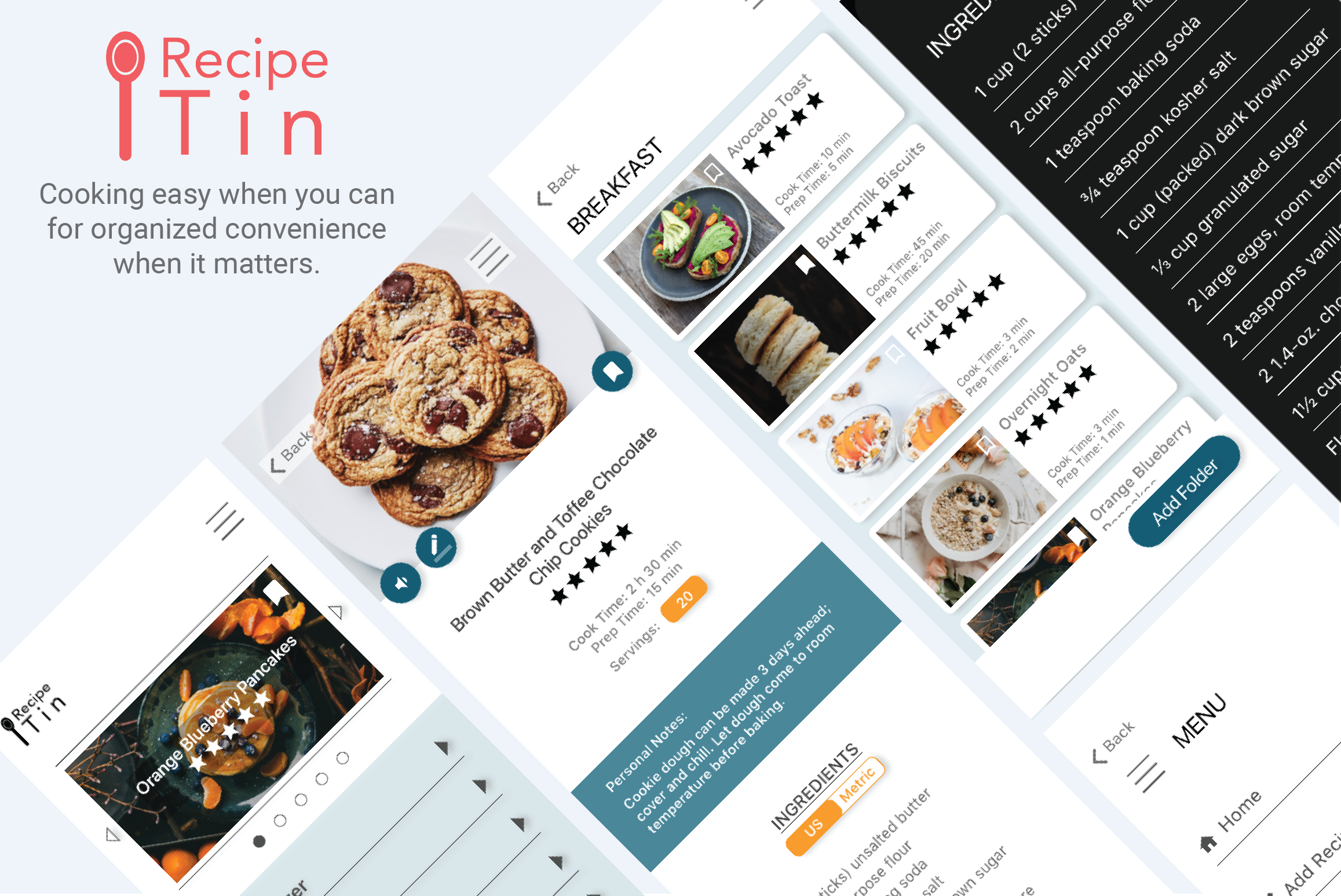
Banner photo of RecipeTin. Cooking easy when you can for organized convenience when it matters.

Recipe Management Case Study

RecipeTin is a mobile application that is the modern take on collecting recipe cards. Store your recipes in one place and keep tabs on recipes you've been meaning to try. RecipeTin makes life easier when it comes to recipe organization, meal planning, and cooking.

View Hi-Fi Mobile Prototype
Scope: Team project where I focused as a UX/UI Designer and Project Manager. This project took place over 2 weeks.
PROBLEM

Homemakers lead busy lives. They’re looking for ease and efficiency in their day-to-day to make better use of their time. Meal prepping could be easier when it comes to keeping recipes together and the cooking process itself.

SOLUTION

We created a recipe management system that imports recipes from the web and digitizes physical recipes. Additionally, we empower our users with tools so they can focus on actually cooking.

RESEARCH

Through 5 user interviews and 56 surveys, we discovered that our users currently don't have a good solution for managing recipes. By synthesizing our data, we pulled 5 main takeaways that would guide us through this design process to the end product.
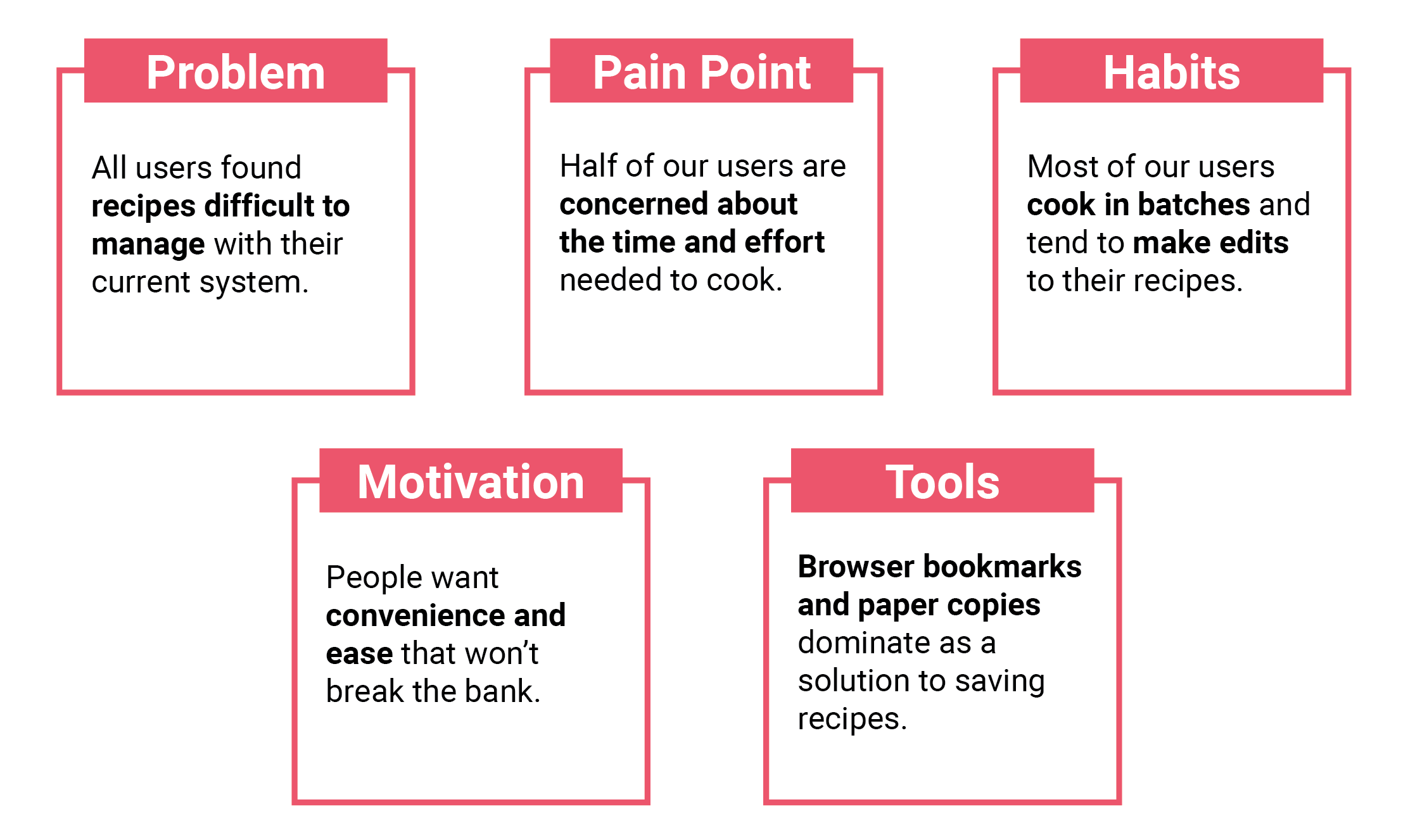
User Interview Insights. 1) All users found recipes difficult to manage with their current system. 2) Half of our users are concerned about the time and effort needed to cook. 3) Most of our users cook in batches and tend to make edits to their recipes. 4) People want convenience and ease that won't break the bank. 5) Browser bookmarks and paper copies dominate as a solution to saving recipes.
User Insights from User Interviews and Survey Data

Since our users primarily use browser bookmarks and paper copies, there are no direct competitors. Below are our indirect competitors in our competitive analysis.
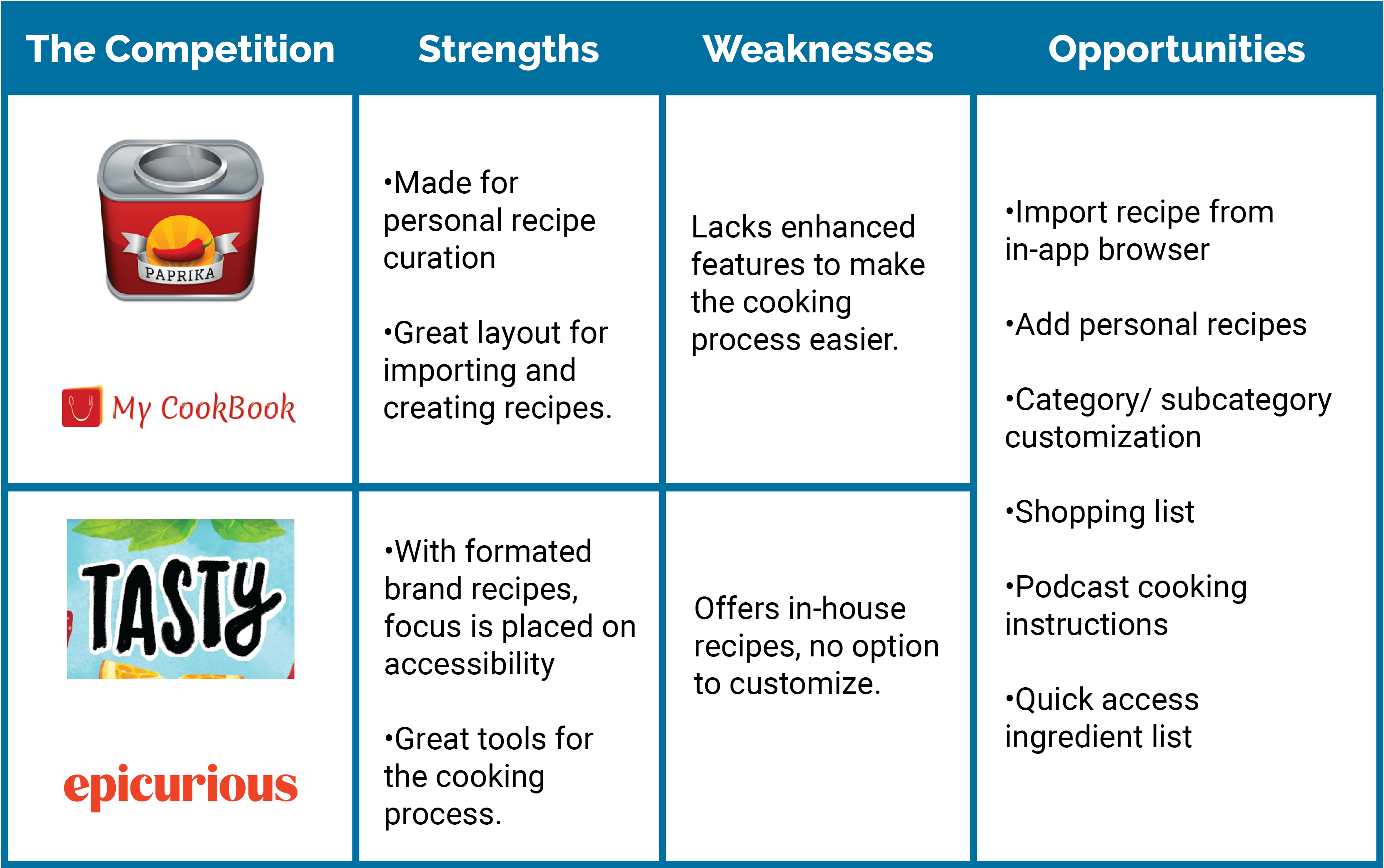
Competitive Analysis covering the strengths, weaknesses, and opportunities in a recipe management application. We saw a division in the type of apps that are currently in the market. One type catered to personal recipe curation that made it easy to import and add recipes. The other was created by a major brand with formated recipes. There are a lot of pros here when it comes to accessibilty and tooling. Weaknesses were where the other app's strenghts were. The opportunity was in blending the two different types of recipe apps: importing recipes from the in-app browser, adding personal recipes, category/subcategory customization, shopping list, podcast cooking instructions, and having a quick access ingredient list.
Competitor Analysis
DEFINITION

We created a user persona from the insights we gathered. This helped us empathize with our users and identify with their mental model.
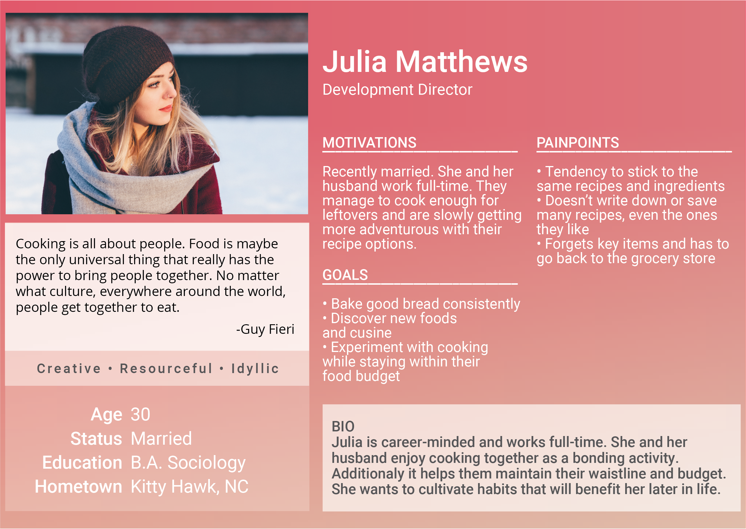
User Persona showcasing Julia Matthews. Julia is a Development Director who's career minded and works full-time. She and her husband cook together as a bonding activity and they are slowly getting more adventurous with their recipe options. She wants to eventually bake bread consistently and experiment with cooking while staying within their food budget. Some painpoints she has is that she tends to stick to the same recipes and ingredients, she has a bad habit of saving recipes she enjoys, and sometimes forgets key items at the grocery store.
User Persona

Next, we took the opportunities identified from our competitive analysis and created a feature prioritization.
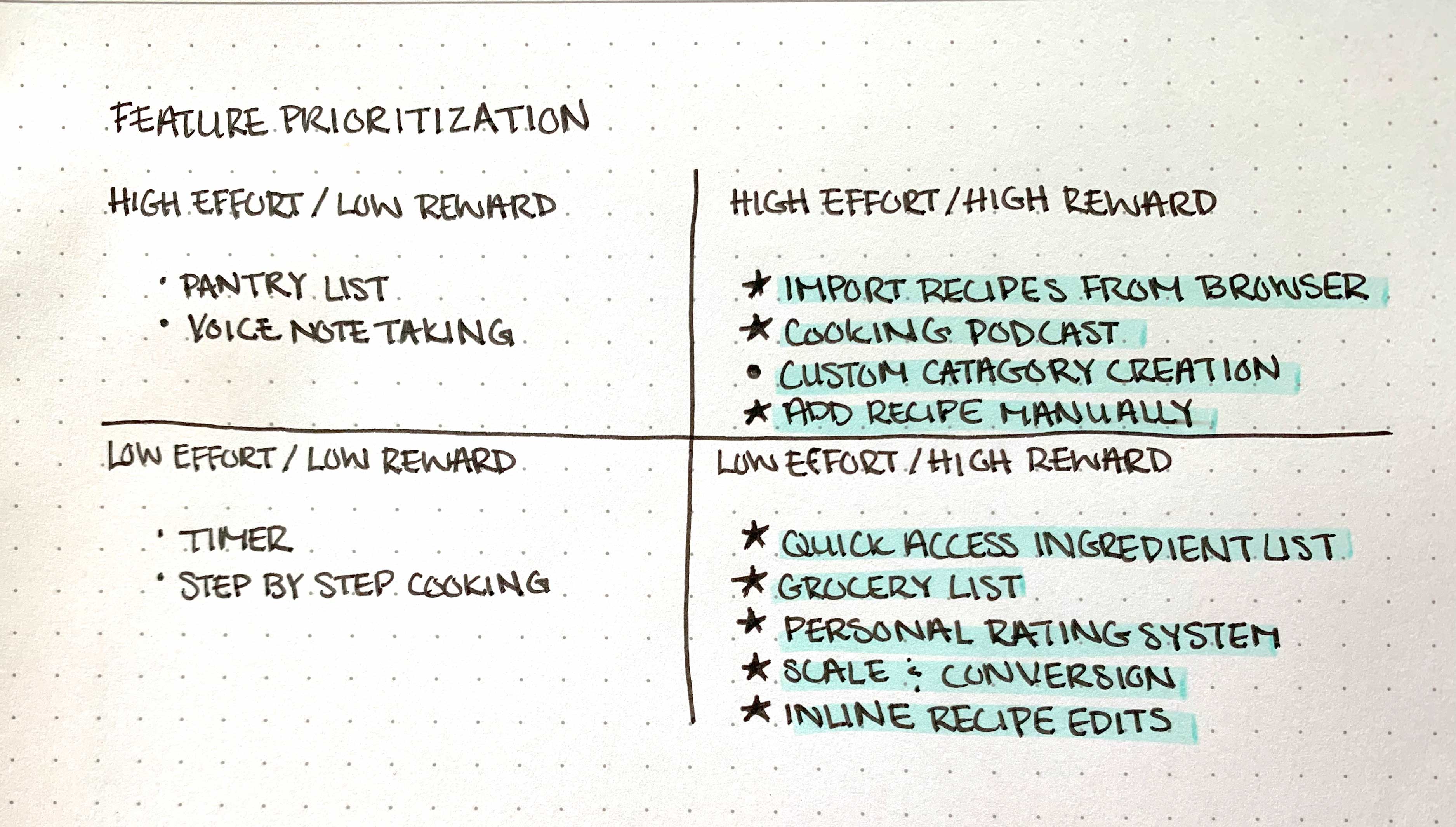
Feature Prioritization highlighting areas to move forward in. This list consists of importing recipes from the browser, podcast cooking, adding recipes manually, having a quick access ingredient list, grocery list, personal rating system, measurement conversion, and inline recipe edits. If there's extra time, having custom category creation would be nice to have.
Feature Prioritization

A user flow diagram gave us a big-picture view of RecipeTin. From the user flow, we were able to discern how each piece relates to each other. We chose to focus on the 2 ways to add recipes: manually and by the in-app browser.
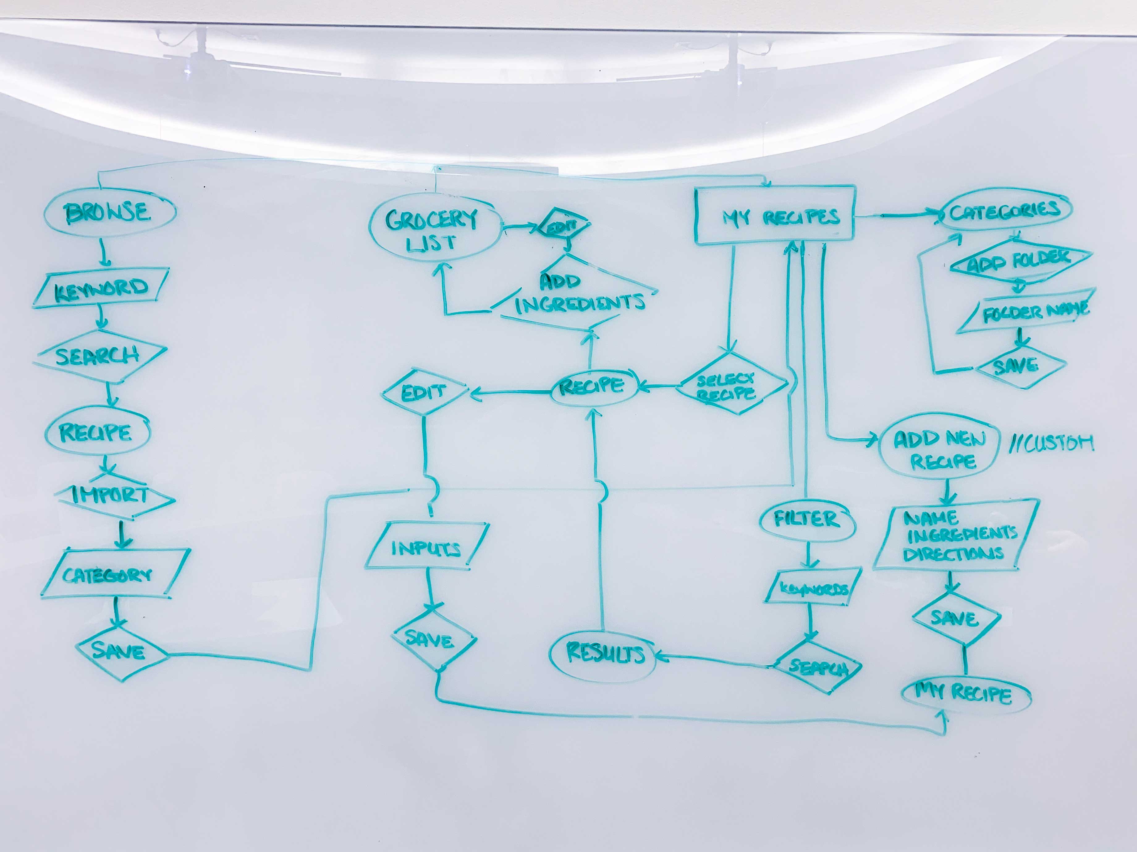
A sketch of our user flow
User Flow
ITERATION

Sketches and Wireframes

Sketches helped us quickly ideate different ways a user could flow through screens. We identified gaps before creating wireframes such as what actions the homepage allows.
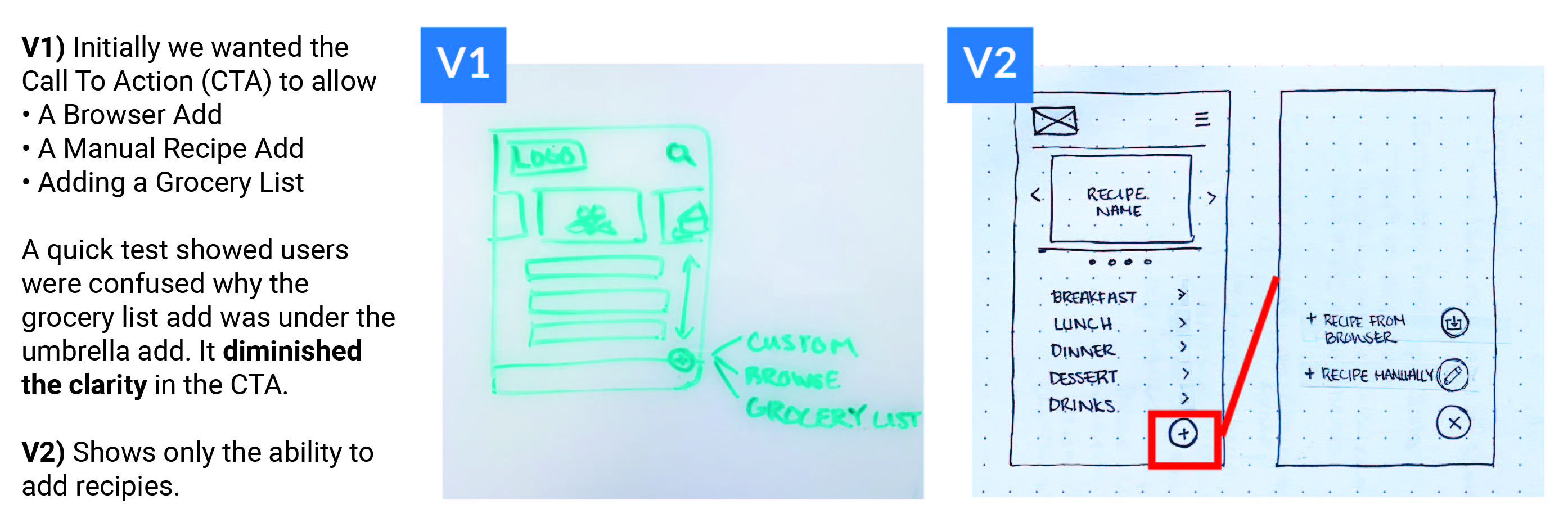
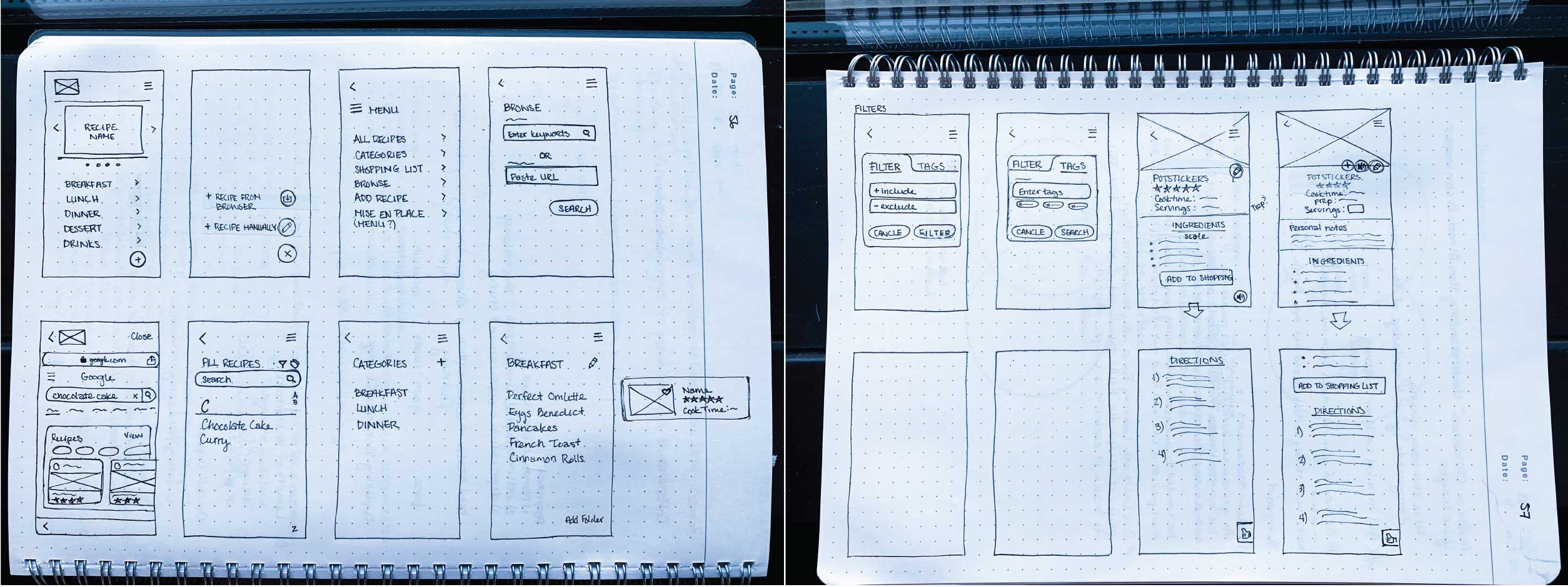
A quick user test showed us that that our Call to Action (CTA) was confusing. The button initially allowed 3 different kind of adds: add recipe from browser, add recipe manually, and add to grocery list. Having the add to grocery list diminished the clarity of the CTA. We ended up removing the grocery list add so that the user can either add a recipe from the brower or add a recipe manually.
Quick User Tests
Initial screen sketches
More Sketches

Below are our wireframes with 2 scenarios:
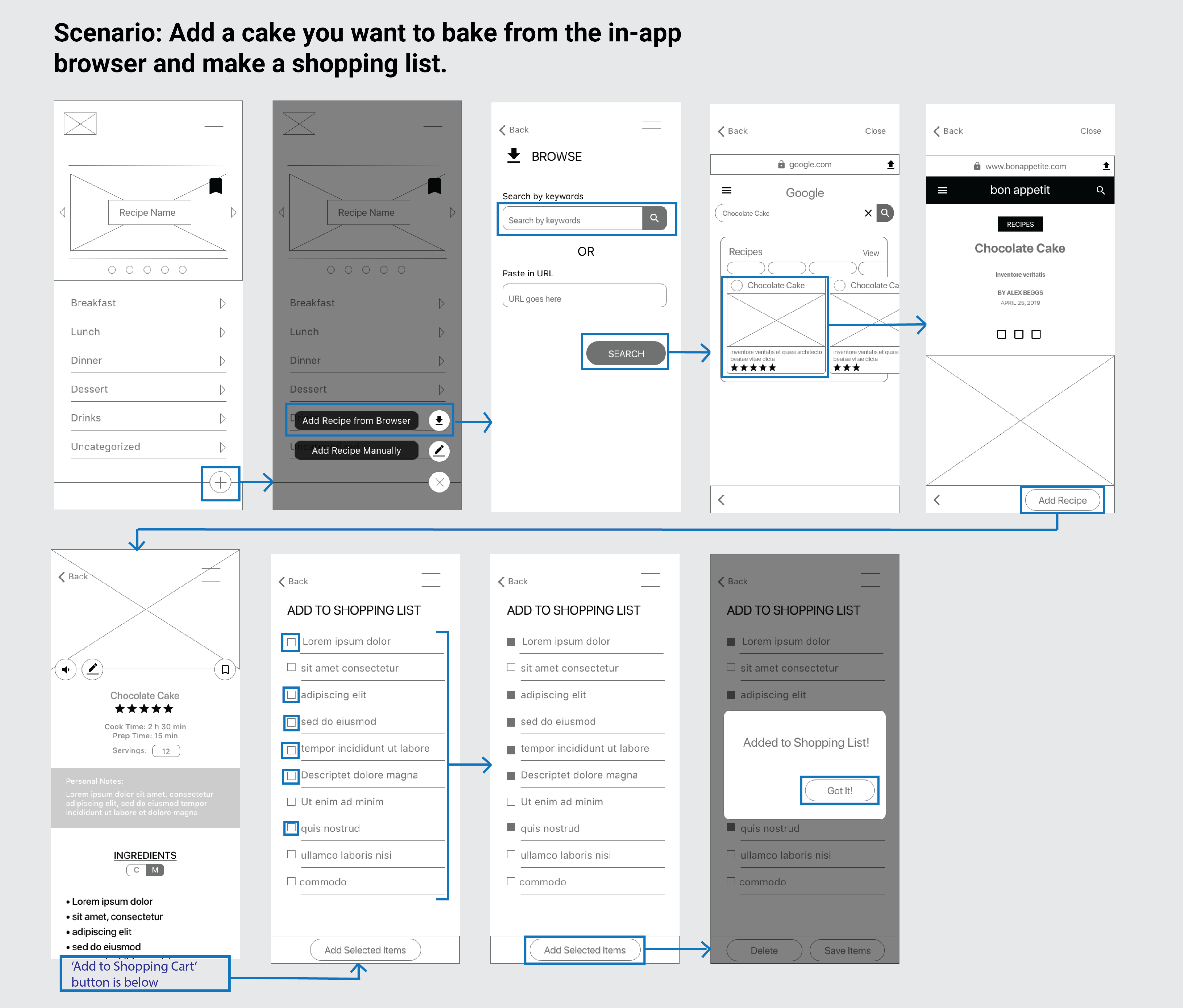
Wireframe Flow 1: Add a cake you want to bake from the in-app browser and make a shopping list.
Wireframe Flow 1: Baking a cake using the in-app browser
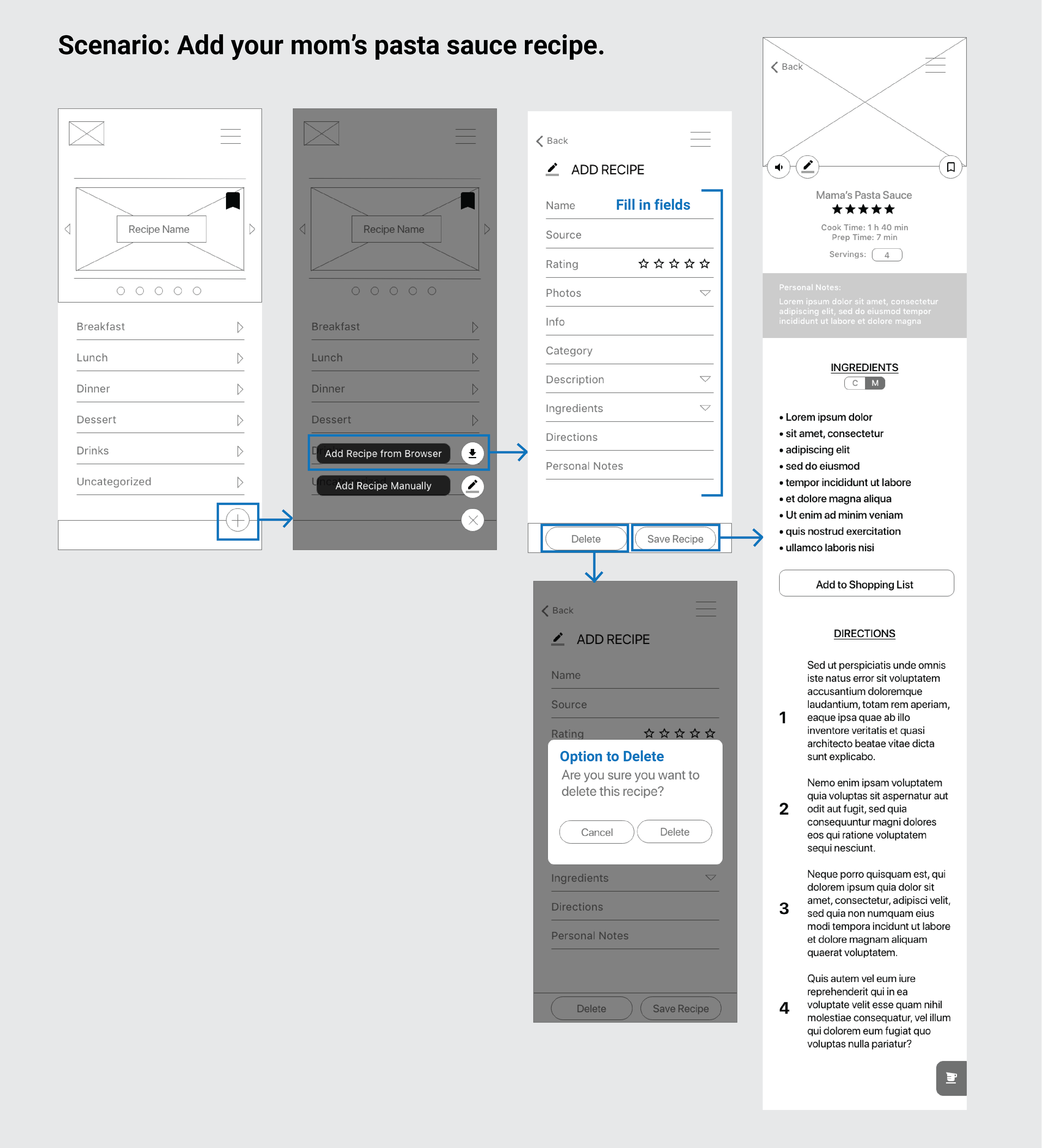
Wireframe Flow 2: Add your mom's pasta sauce recipe.
Wireframe Flow 2: Save your mom's pasta sauce recipe

Other adjustments made were minor and all related to mapping the prototype.

Testing & Improvements

After wireframing, we asked our users to perform a series of tasks: add a recipe you’d like to try from Bon Appetit, add a physical recipe, and create a shopping list. Much to our surprise, we had the most problems with the menu.
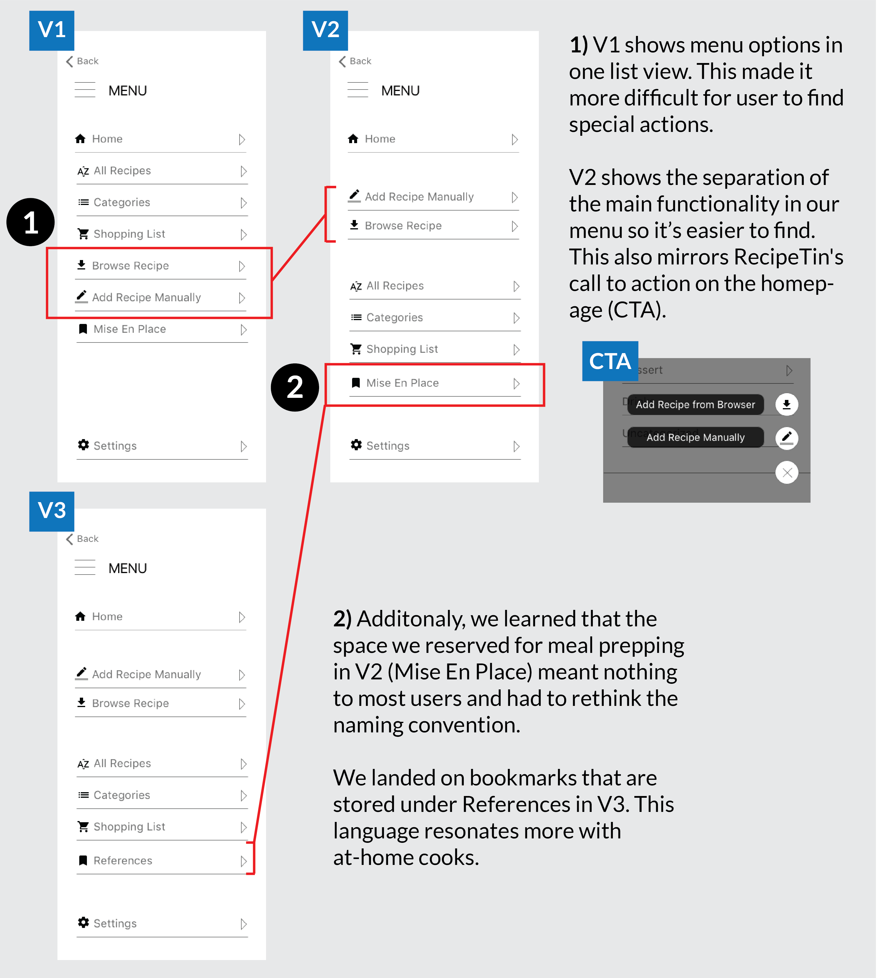
Image shoing the iteration of the menu screen. The initial menu had a condensed list of options to choose from, in a block form. This made it more difficult for users to find specific actions. In the new screen, the list is broken up so that the recipe adds are in their own section. We also learned that the space we left for meal prepping, Mise En Place, meant nothing to most users. We had to rethink the naming convention and chose to move forward with References to house the bookmarks our users can add.
Testing and Iteration on the Menu
RESULT
Mobile view of RecipeTin: Home, Browse Recipe, and Recipe View View Hi-Fi Mobile Prototype

Final Thoughts

  • Features that considered the user's environment were well received. A feature specifically mentioned was the quick access ingredient list in RecipeTin.
  • People want ease and convenience when it comes to searching for recipes. This should be the guiding compass for improvements and future features.
  • The next logical step is to allow users to import recipes via a photo to digitize their recipe followed by personal category creation.
  • We would also like to open this app up to a network where users can share recipes with their friends and family.