A Peer-to-Peer Rental Platform
Trellis came from our team's mutual love for the library and the idea of sharing. A library's impact on any given community is significant in terms of accessibility, cost, flexibility, and more. We wanted to take it further and offer a solution that allows communities to take advantage of its available resources through rentals.
CHALLENGE
In a world where instant gratification and purchasing power rules, what does the optimal renting experience look like if you could rent anything?
SOLUTION
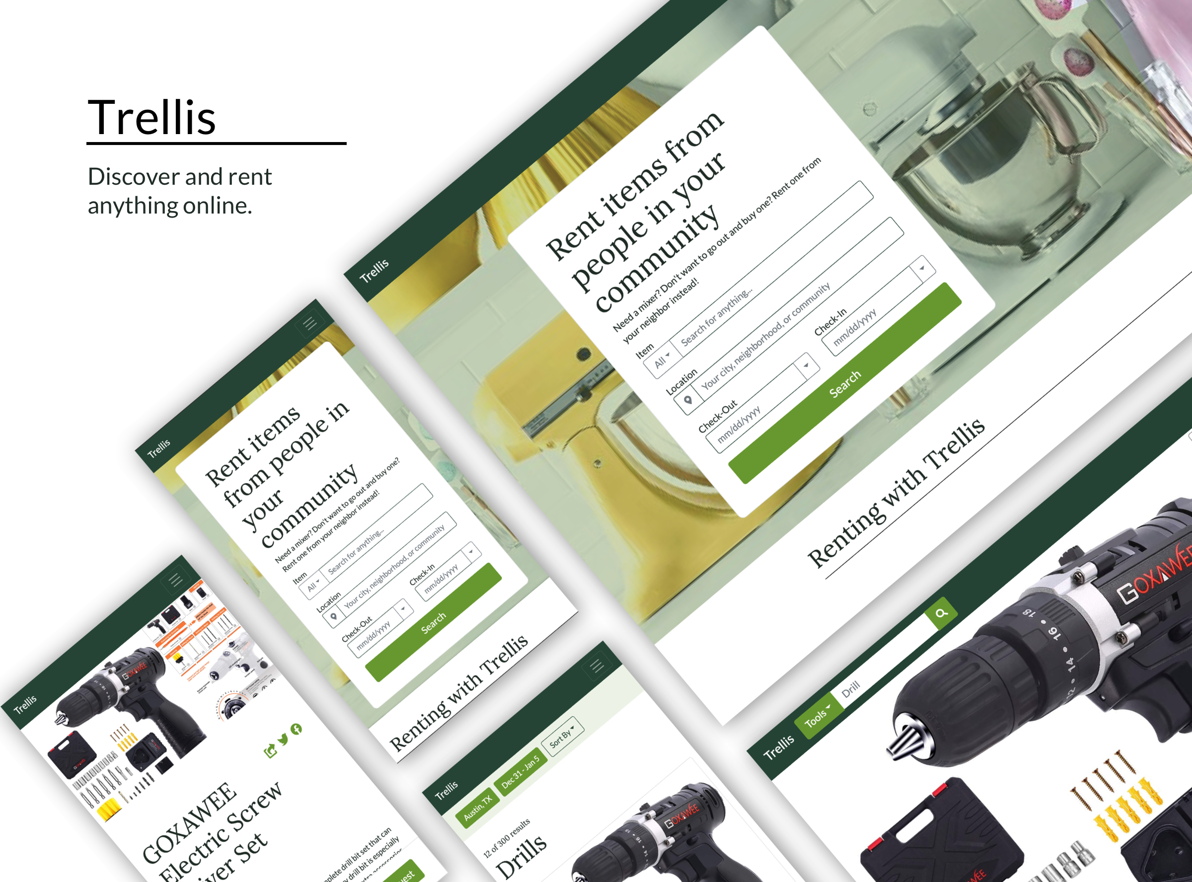
We designed a go-to rental platform. A place with a collection of various items that you can discover and borrow from the community. Trellis aims to streamline a renter's renting experience.
PROJECT DETAILS
Team of 3 over the course of 2 1/2 weeks.
MY FOCUS
- UX Researcher
- UX Designer
- Front-End Developer
- Project Manager
MY DELIVERABLES
- User Interviews
- Survey
- User Flow
- Wireframing
- Lo-fi Prototype
- Coded Website
TOOLS
- Whiteboard
- Illustrator
- Adobe XD
- Trello
- G Suite
RESEARCH
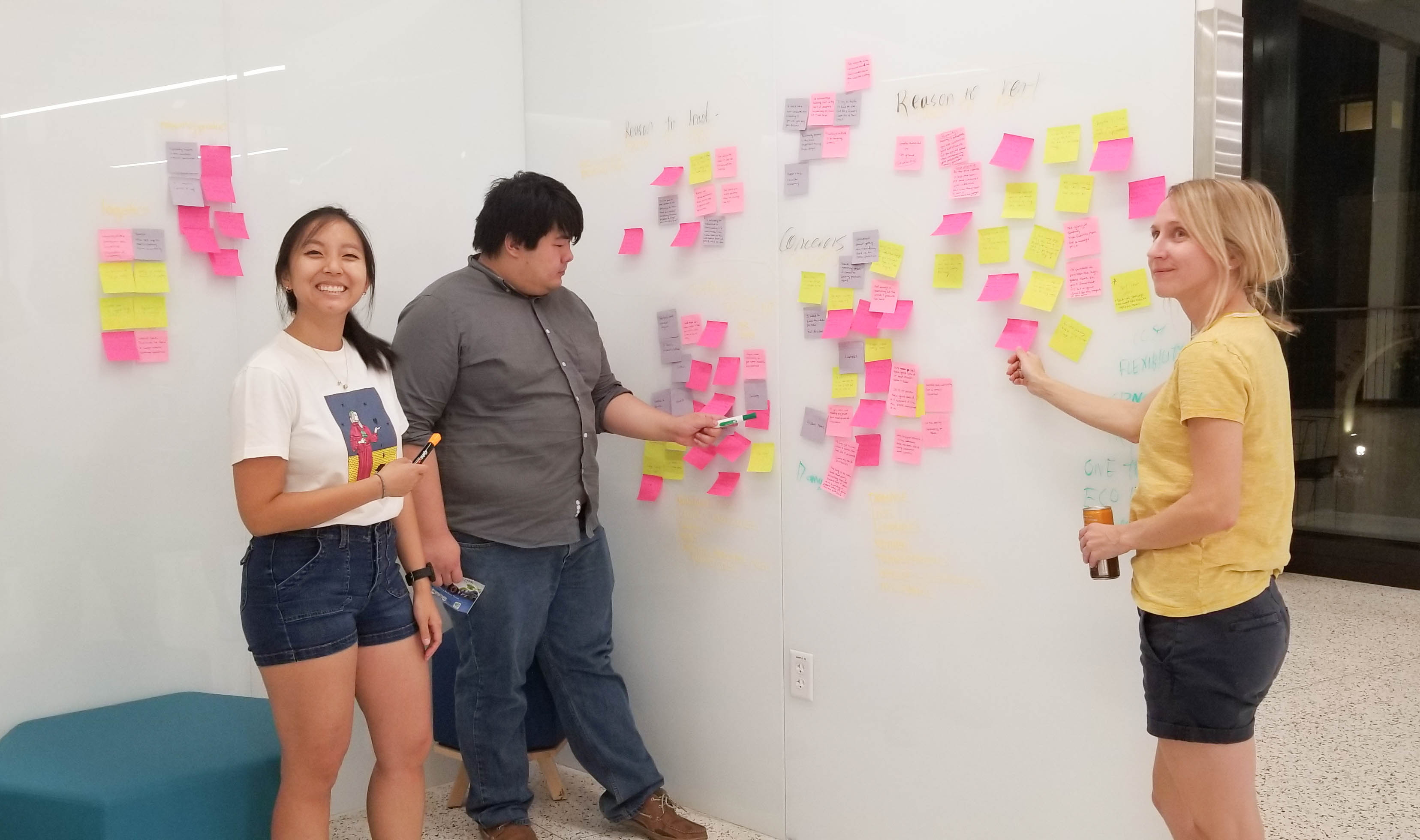
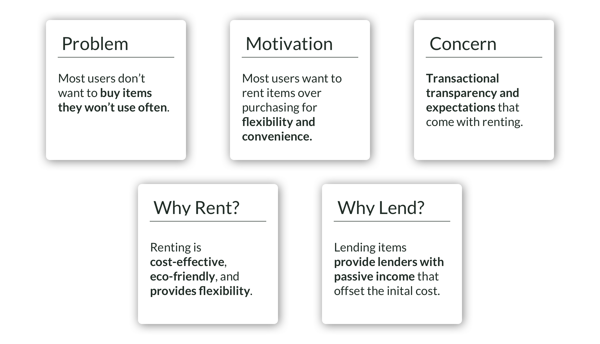
To better understand the market, we conducted research: five user interviews, one interview with a business, and surveyed our network. We then pulled data points from our interview transcripts to create an affinity map. The biggest take-aways are in the diagram below.
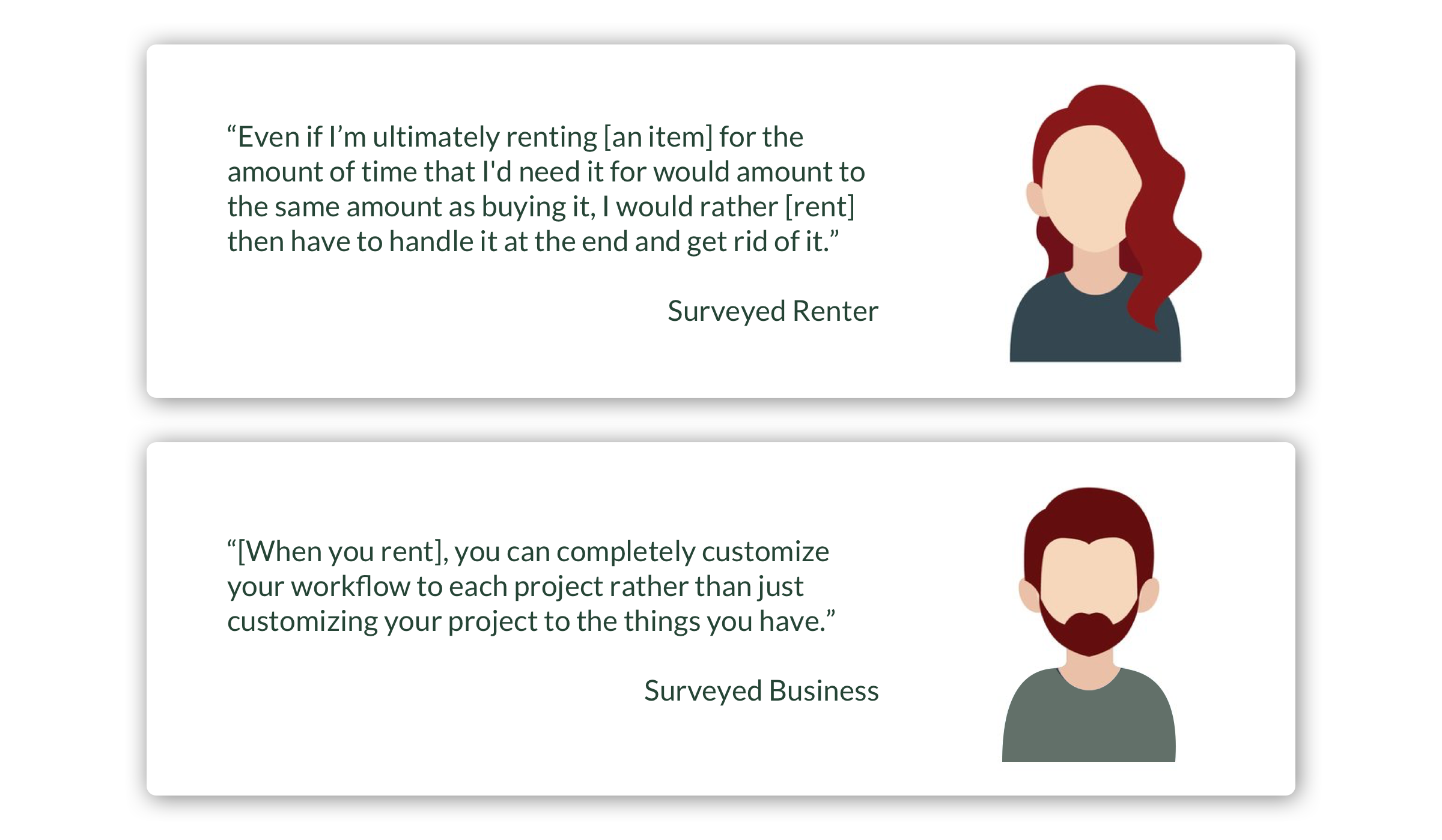
We were also able to pull quotes that highlight the importance of renting: convenience and flexibility.
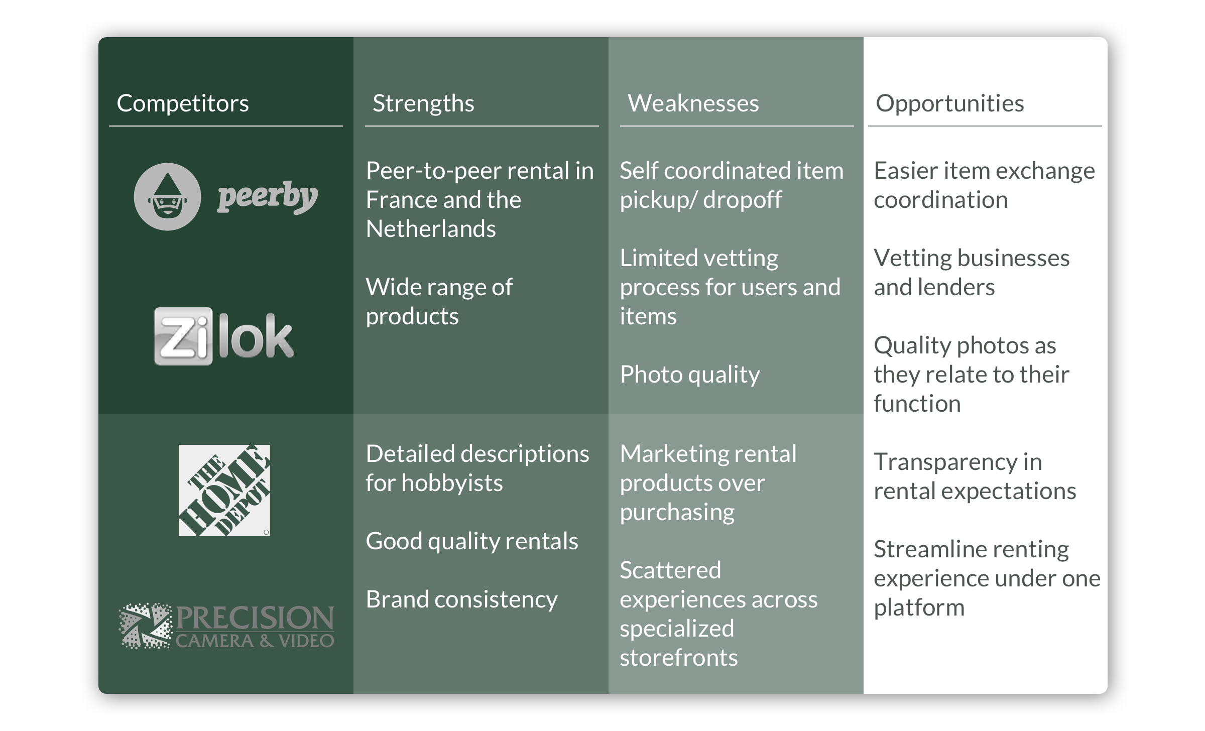
We also conducted market research. We learned that although there are direct competitors, they are not in the US market. Businesses that offer rental services in the US, however, are more specialized. Using the information gathered, we mapped out our opportunities.
PROJECT DEFINITION
To bring this idea to life, we created a user persona for our renter, one that aligns with our interviews and insights. Meet Jane Stevens.
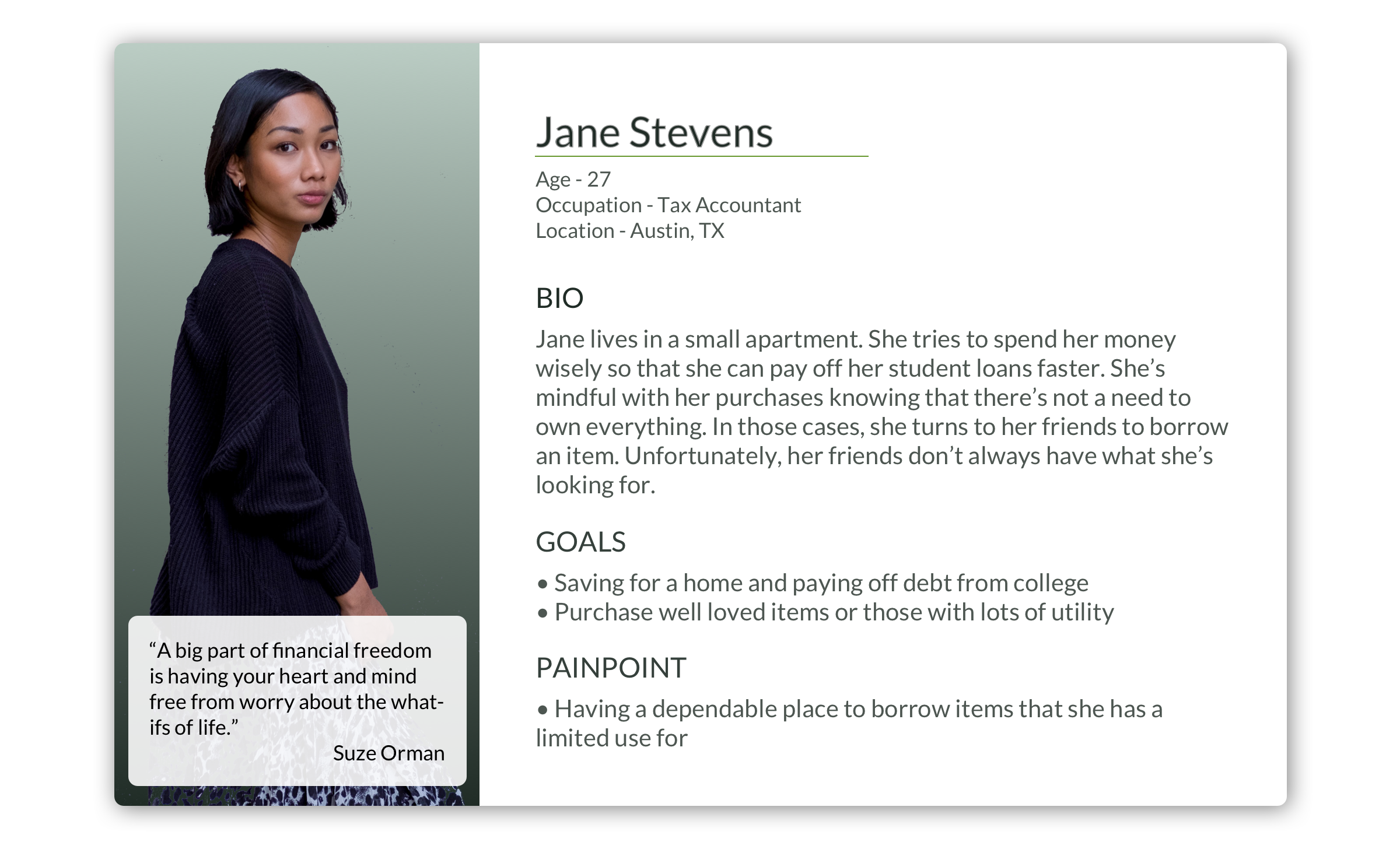
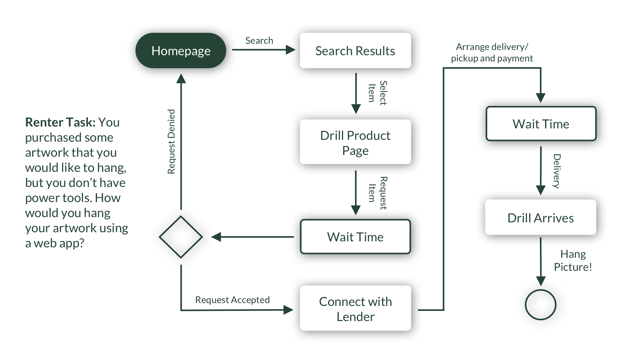
Jane has recently purchased some artwork to hang in her apartment. As luck would have it, she doesn't have the tools to hang her art, nor do her friends. Below we face Jane's predicament with a Renter's task.
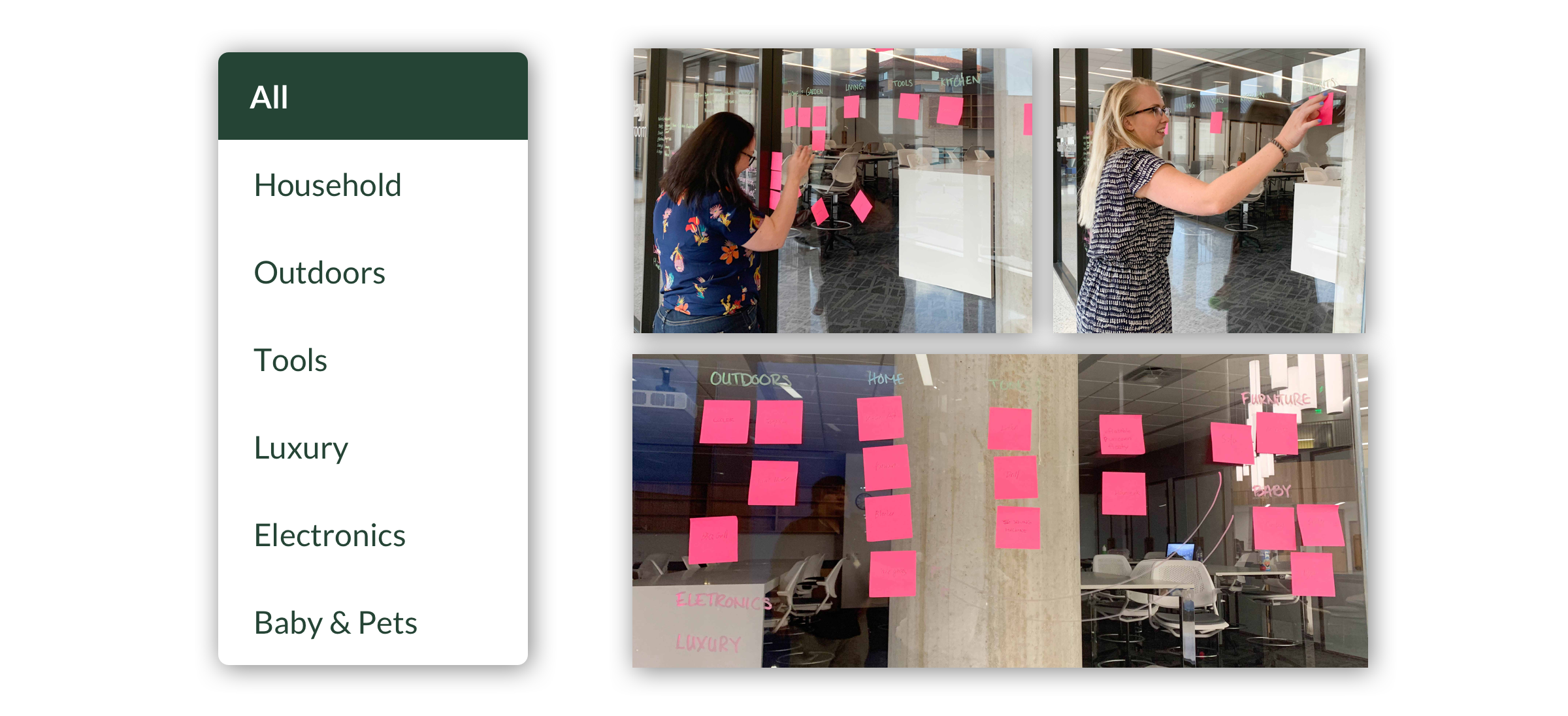
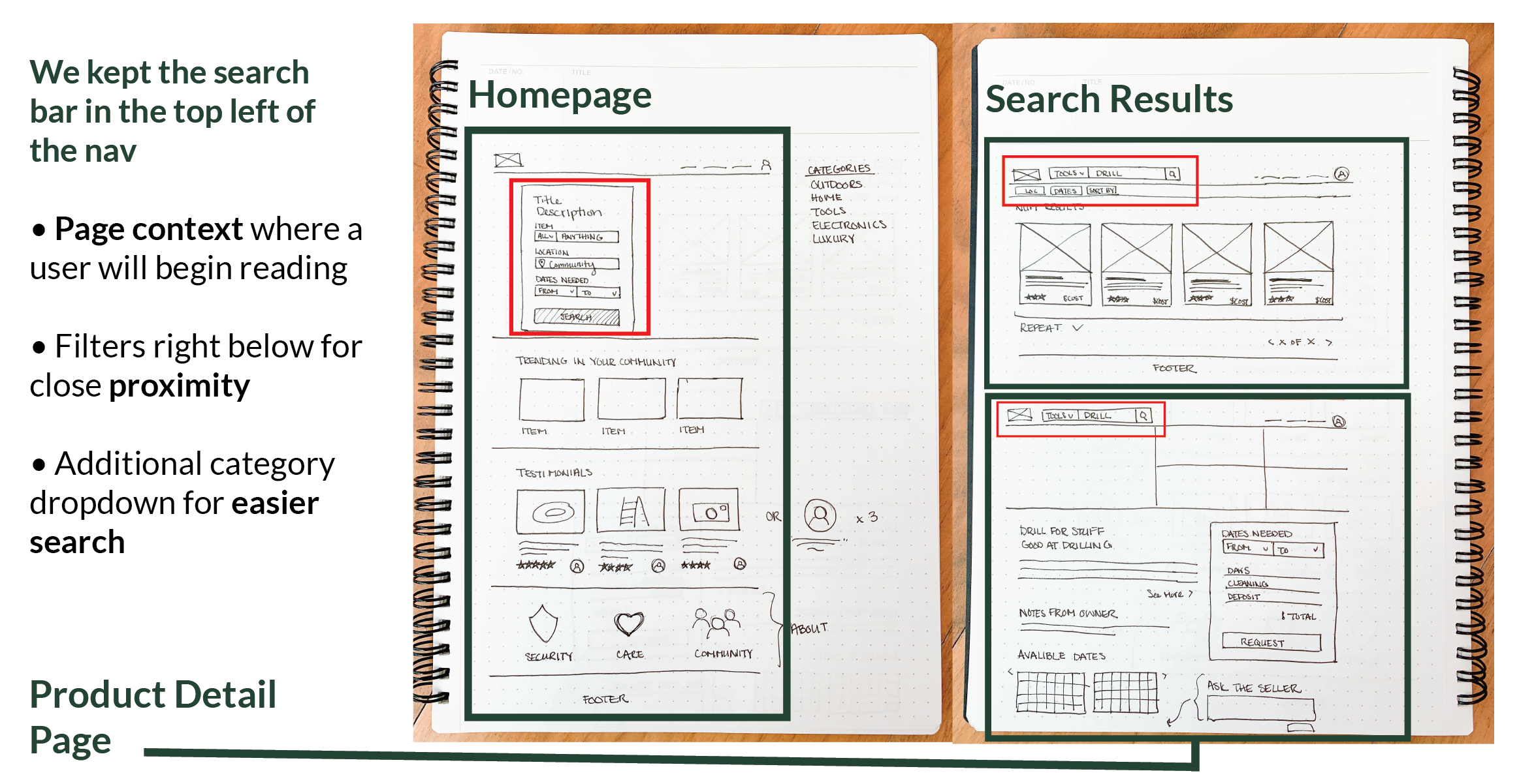
We recognized the importance of structure in our web app, particularly when it comes down to categories. A site that has the potential to house anything needs order, so we did a card sort to nail it down. We tested groupings, and we tried out categories. Two items gave the most headaches because of the different interpretations people had: a ladder and a stroller. In the end, we came up with Household, Outdoors, Tools, Luxury, Electronics, and Baby & Pets.
ITERATION
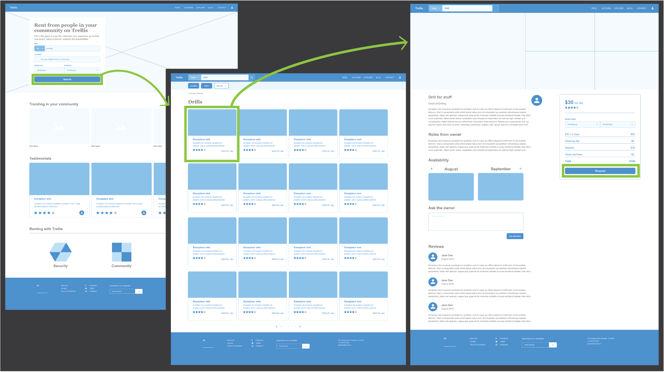
Sketches and Wireframes
Sketching was a very smooth process with most of the discussion revolving around the search bar placement and how our users will filter items.
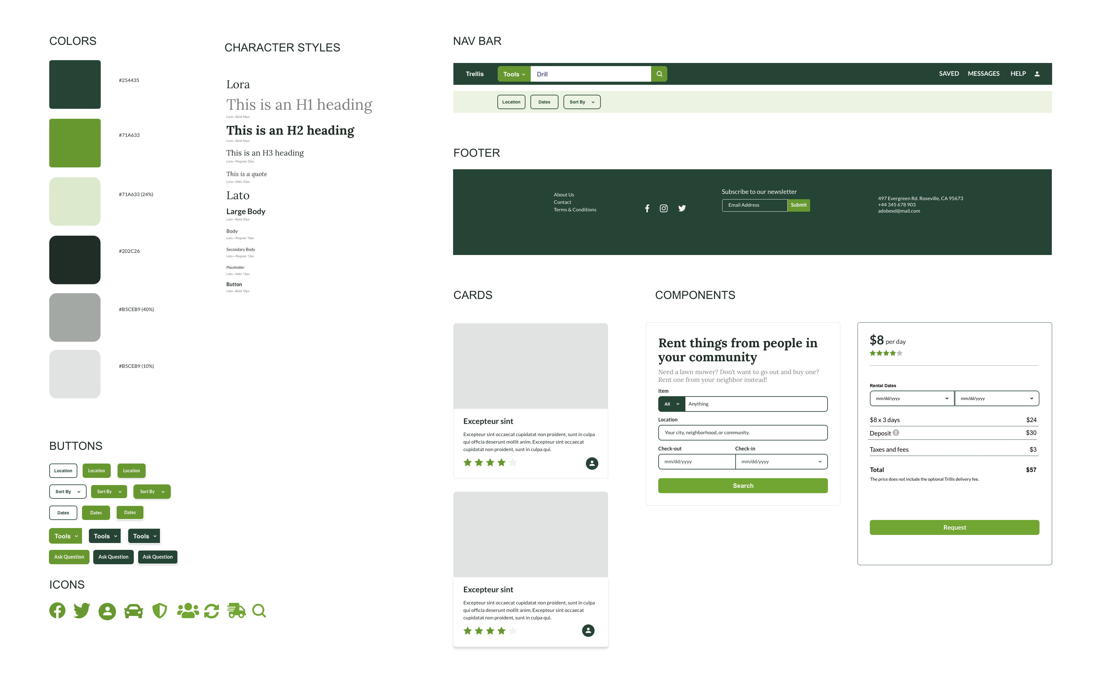
Style Guide
Our team thought it was important to create a simple, clean design. Even more so because Trellis will be full of photos of all kinds of rental items. We chose green to touch on the environmental friendly aspect of Trellis.
Testing & Improvements
After creating our wireframes we tested our user flow. Users had no issues completing the task. However, there were some concerns raised that we addressed below.
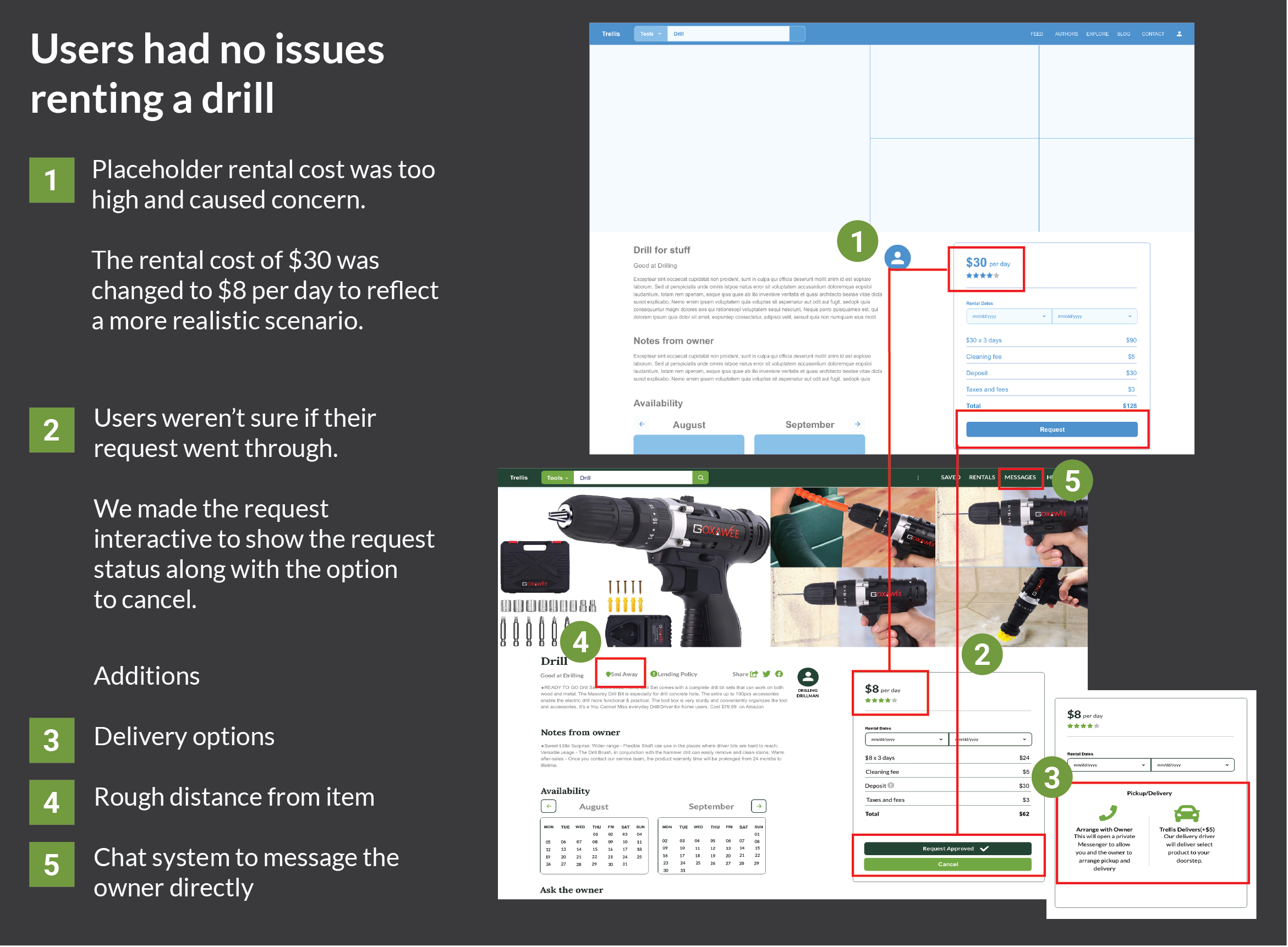
We were curious about whether people would impulse rent items. And debated the importance of transparency and maximizing above-the-fold content.
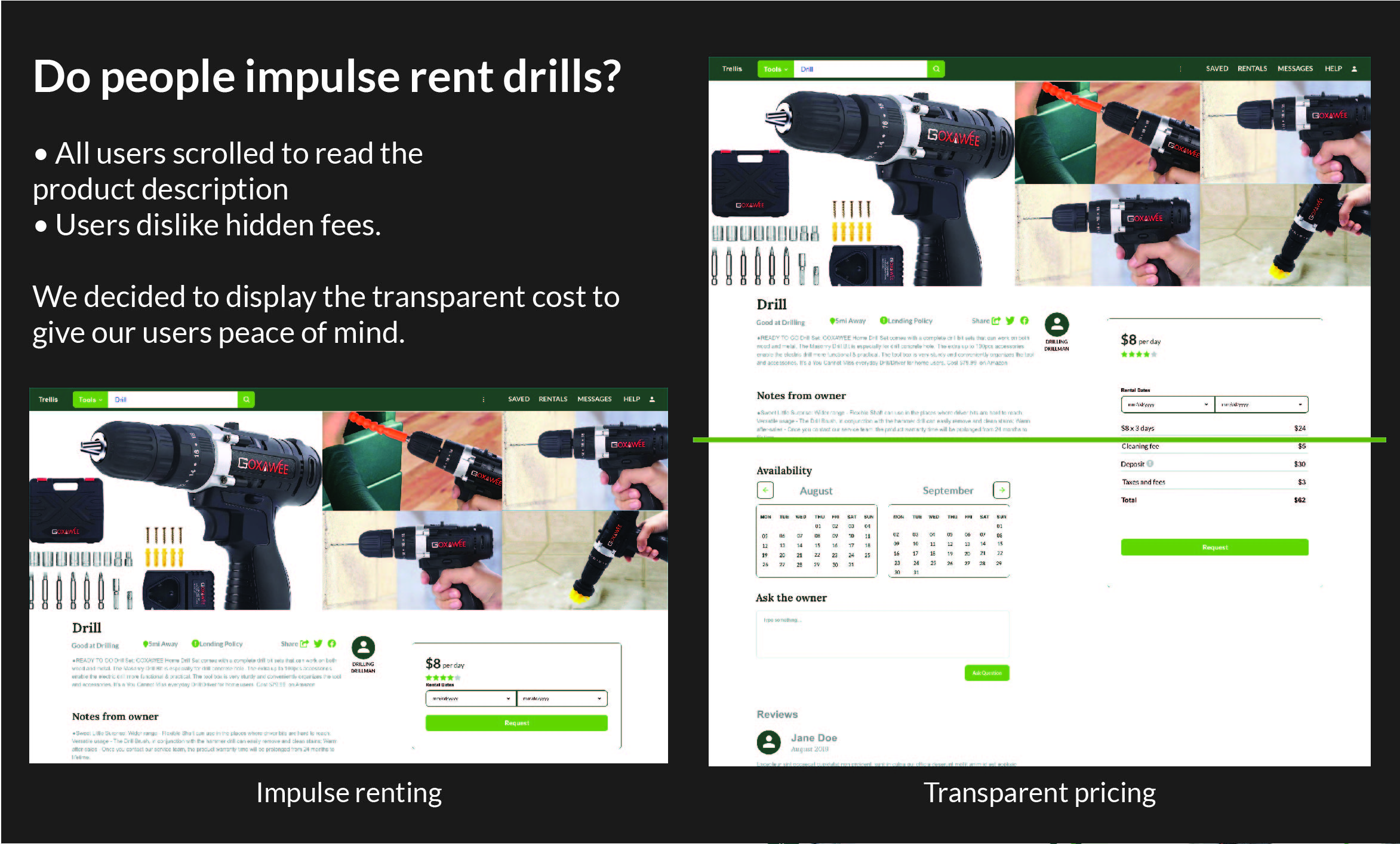
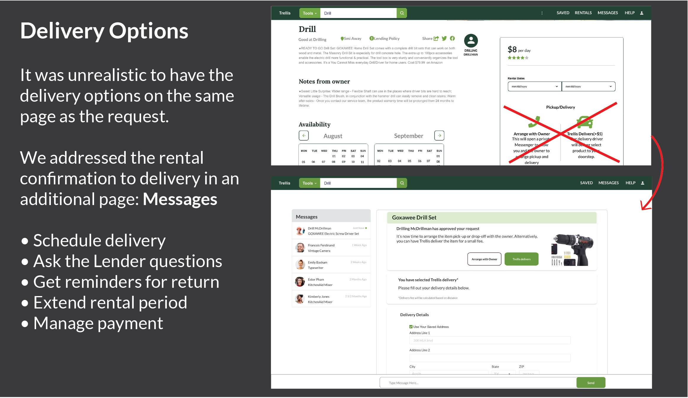
We continued testing and refining the flow. Below you can see the results based on the feedback on delivery.
RESULT
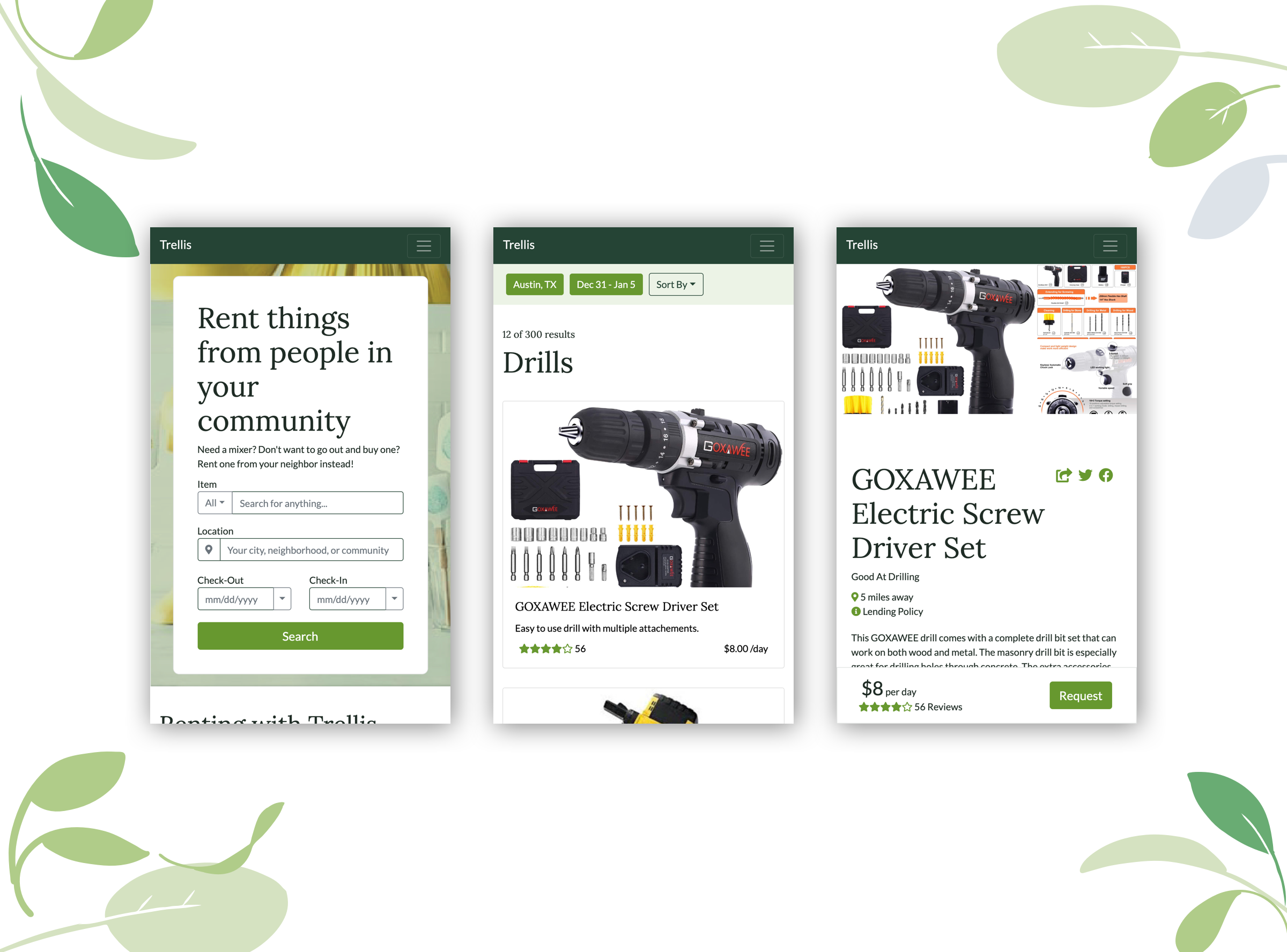 View Coded Prototype
Final Thoughts
- This project was a success. We identified a gap in the U.S. market that hasn’t been tapped yet. Trellis supports a circular economy of reusing resources. From a business perspective, there's little to maintain outside of logistics. Overall, a great return in business value that has buy-in from both rentees and renters.
- This was a great team to work with. We had some healthy internal debates about aspects of our design and made good use of whiteboards, windows, and sticky notes to work through our design challenges.
- We found ourselves with many parking lot items. The next logical step is to look into improving the categorization of products, especially clothing and luxury items.
- Given more time, I would build out the last responsive page in the flow.