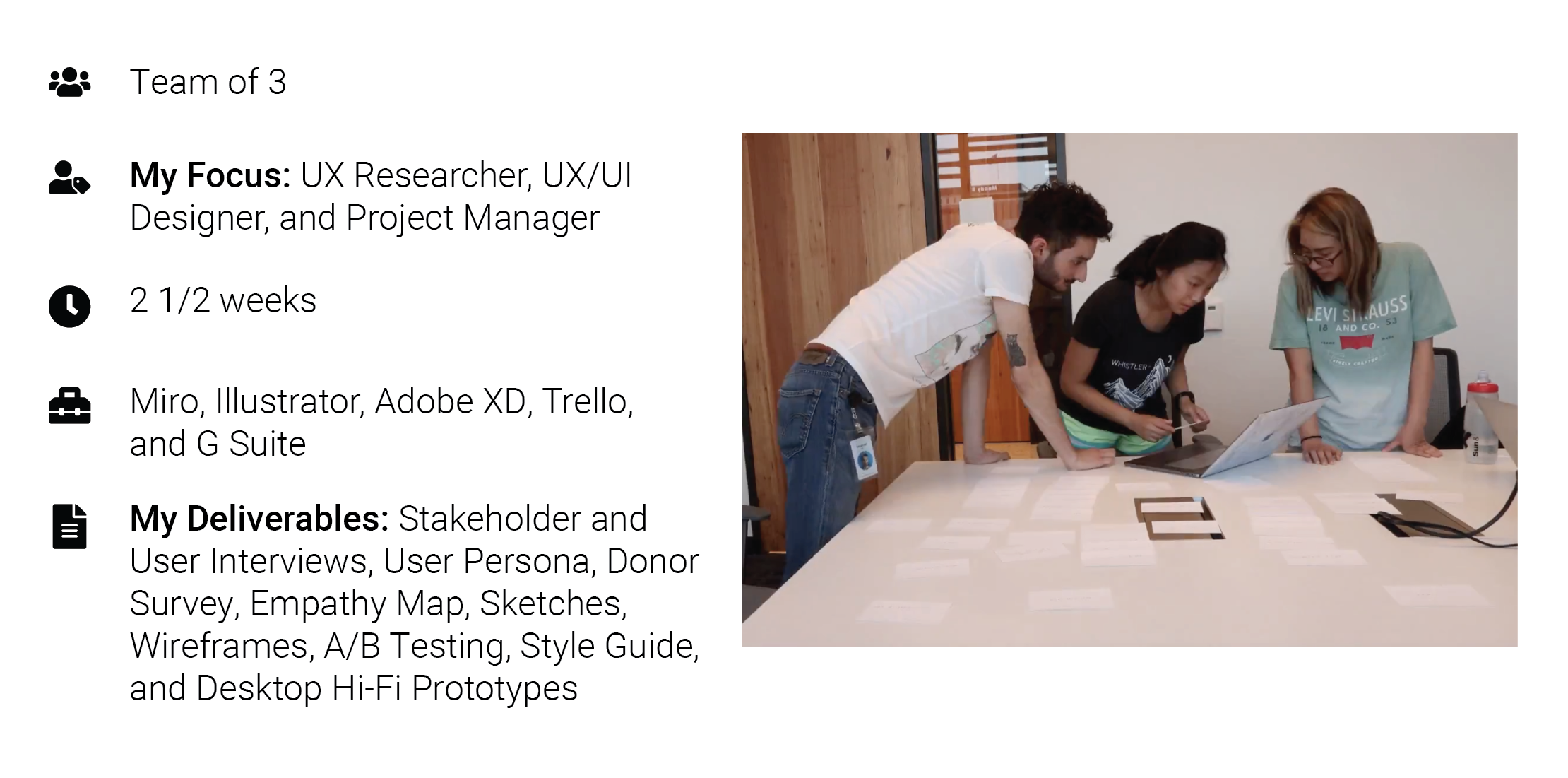
Front Steps Website Redesign
Front Steps is a non-profit in Austin, TX. It focuses on solving homelessness in the greater Austin area. In this project, our team designs a resource roadmap for a person experiencing homelessness.
PROBLEM
One of the most effective ways of solving homelessness is through prevention. Front Steps' prioritizes solving homelessness by equipping those experiencing it with resources. Yet, their target users are not utilizing the website as a resource to do so.
SOLUTION
We recommend creating a roadmap to help guide people experiencing homelessness to the resources they need immediately.
RESEARCH
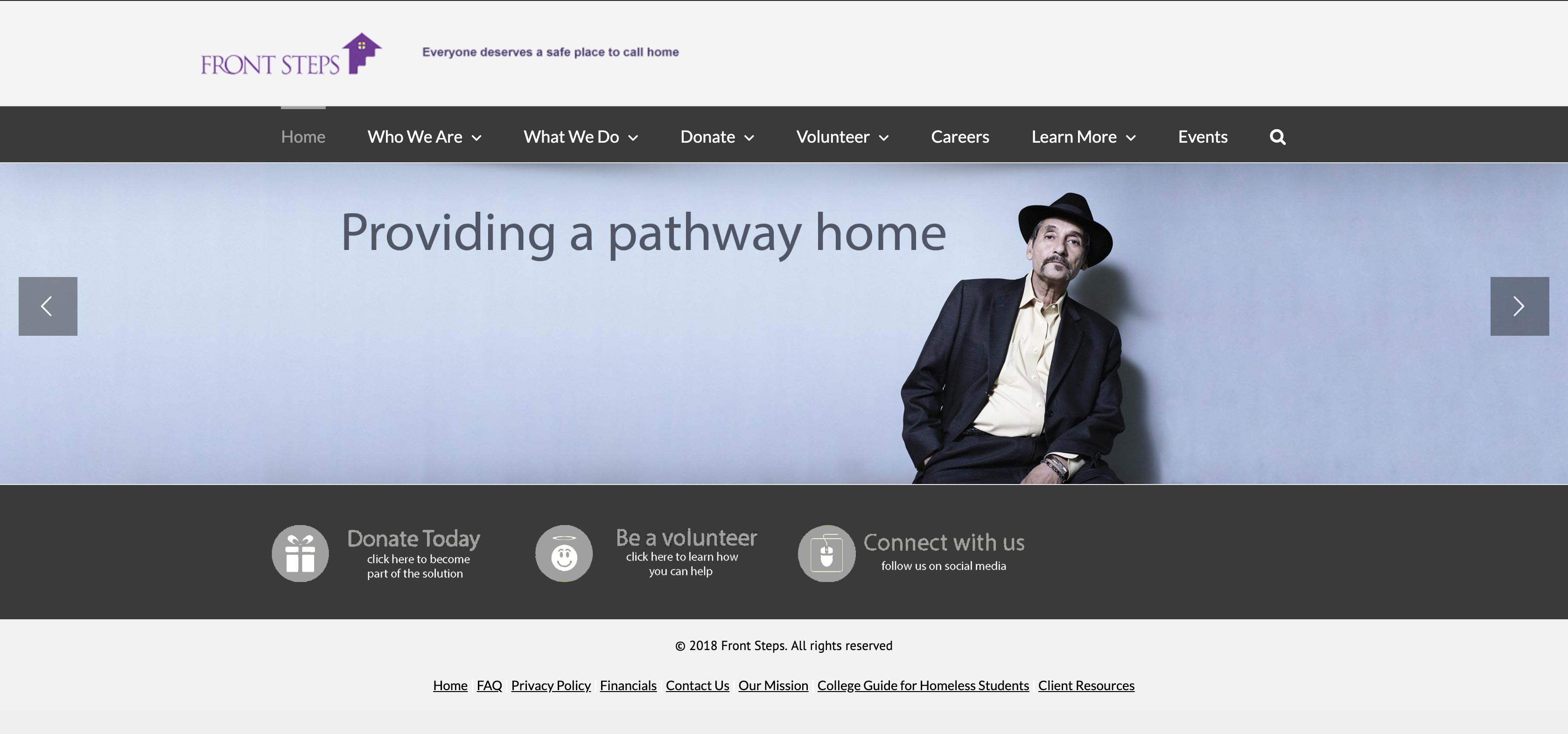
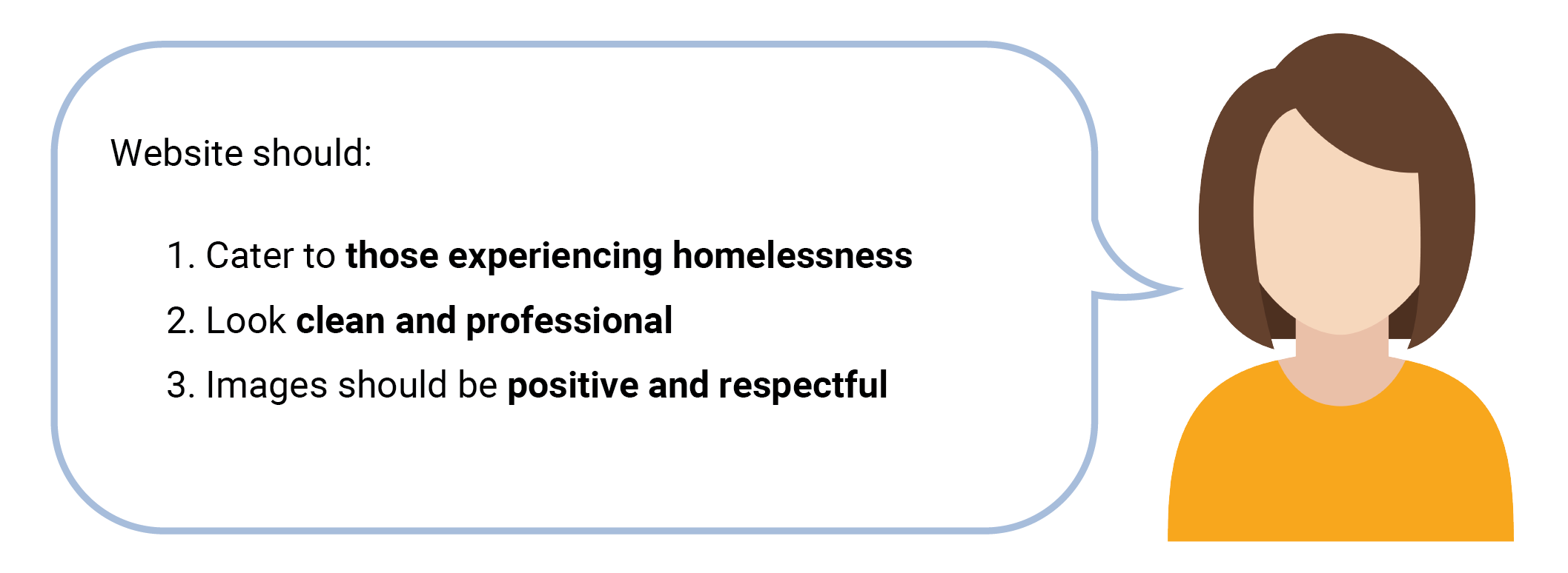
Our team worked with a lot of assumptions until meeting with our stakeholders. We were informed that most of the information on the website needs to be updated. This meant that we were effectively working with a blank slate to breath new life into the site. Below are their top 3 criteria:
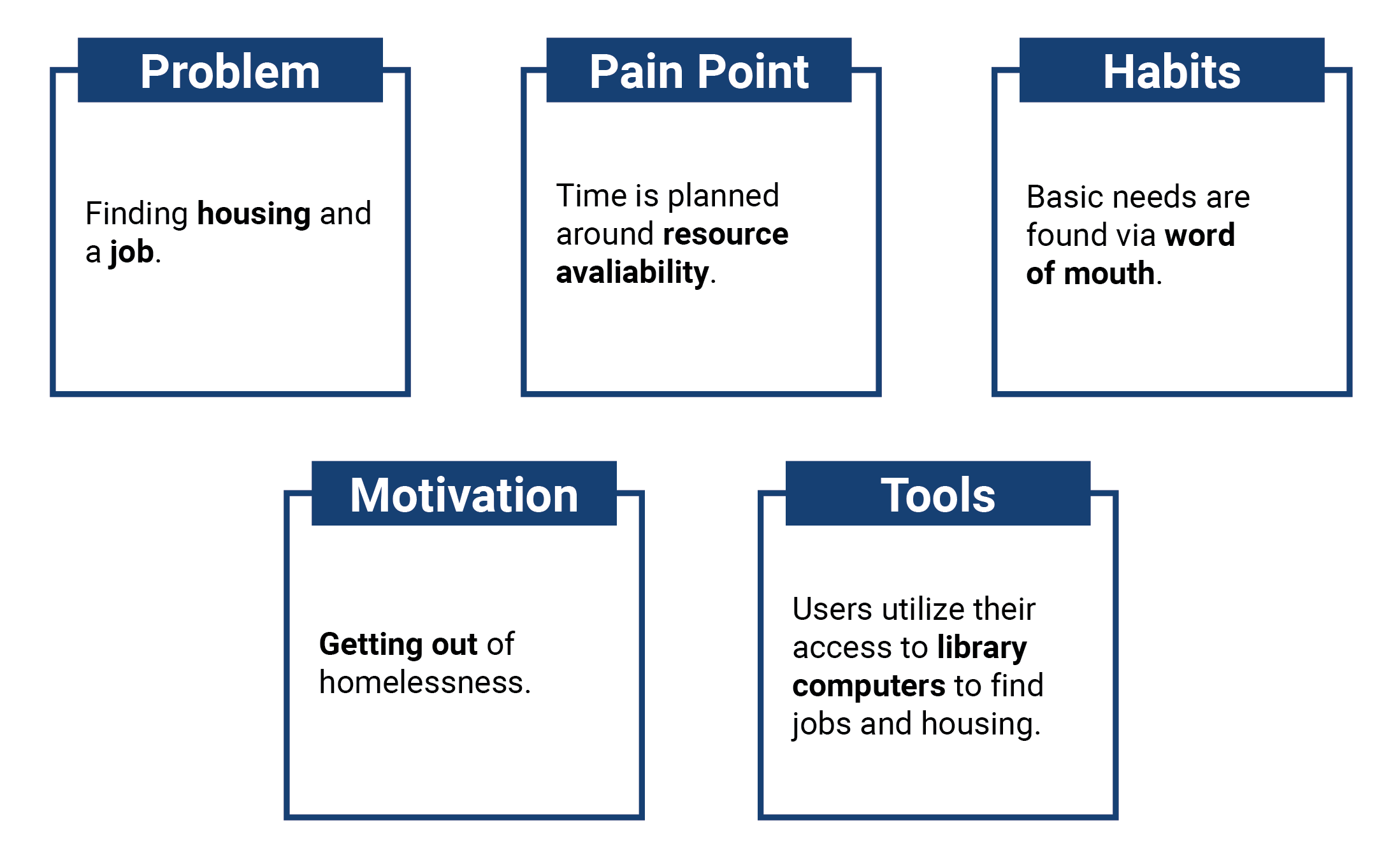
Front Steps wants to focus on people experiencing homelessness through their online presence. So we looked to the data gathered from our user interviews that we conducted downtown.
DEFINITION
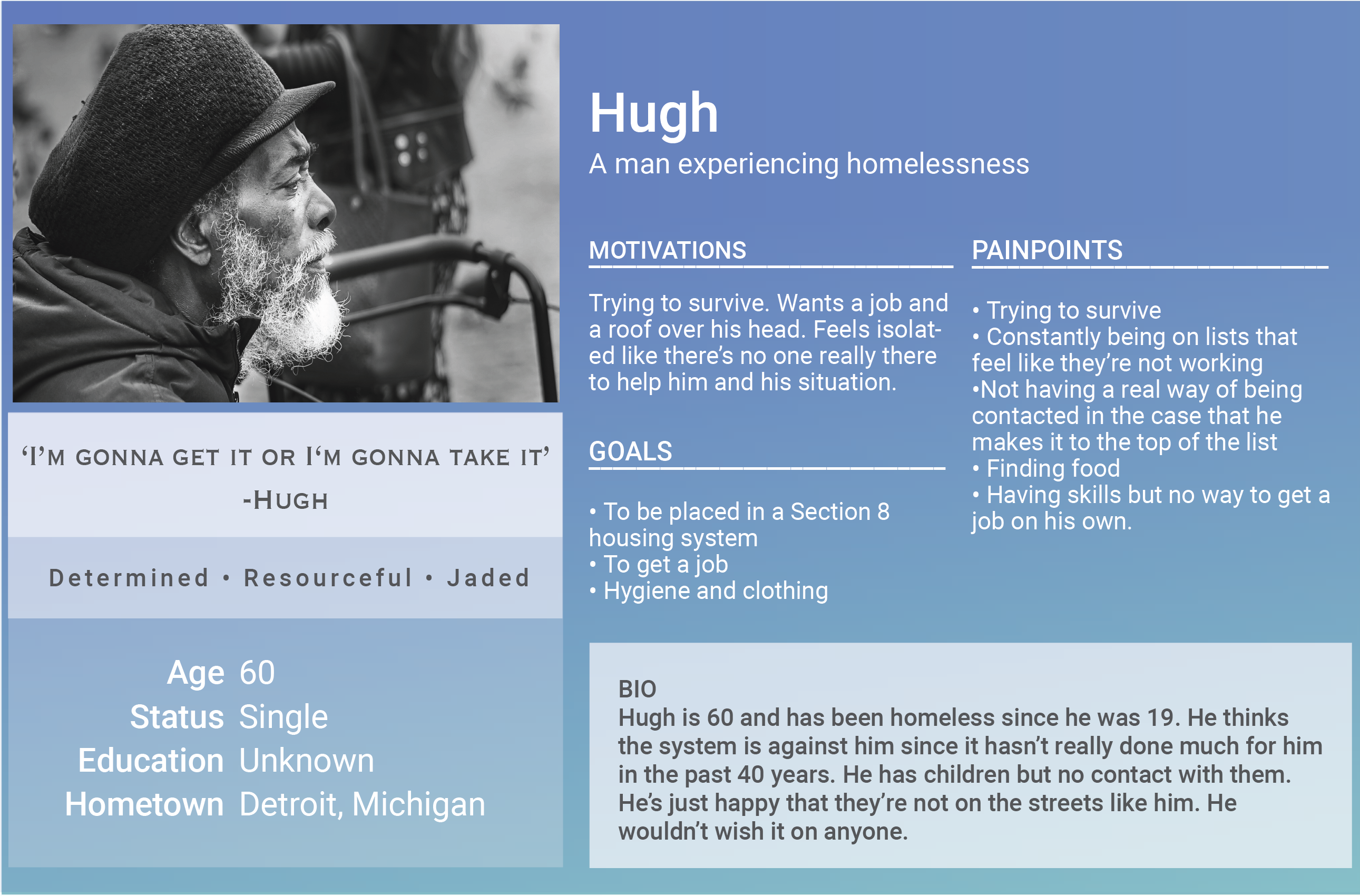
We chose someone who's been living in a longer state of homelessness to get the big picture of their hardships, as they apply to those in less severe cases.
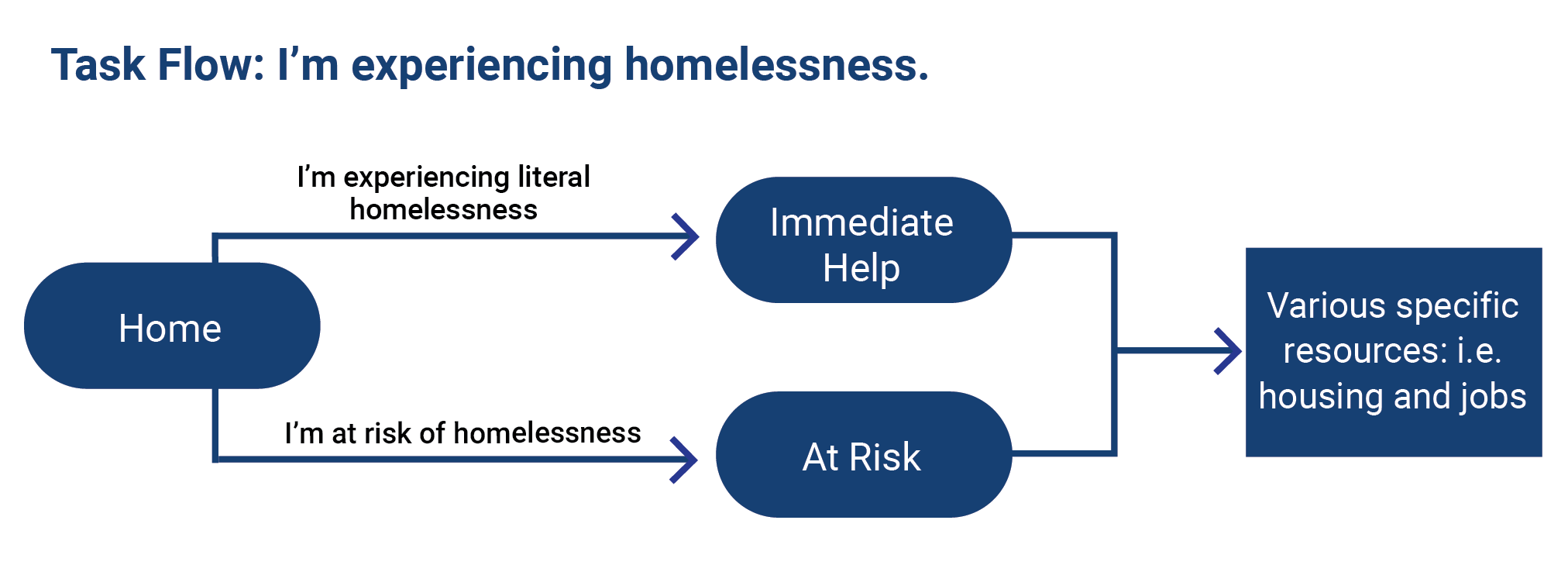
Homelessness is best solved through prevention, so we focused on getting people to the resources they need in our user task flow. In a website context, the most effective way we can help is by improving SEO.
ITERATION
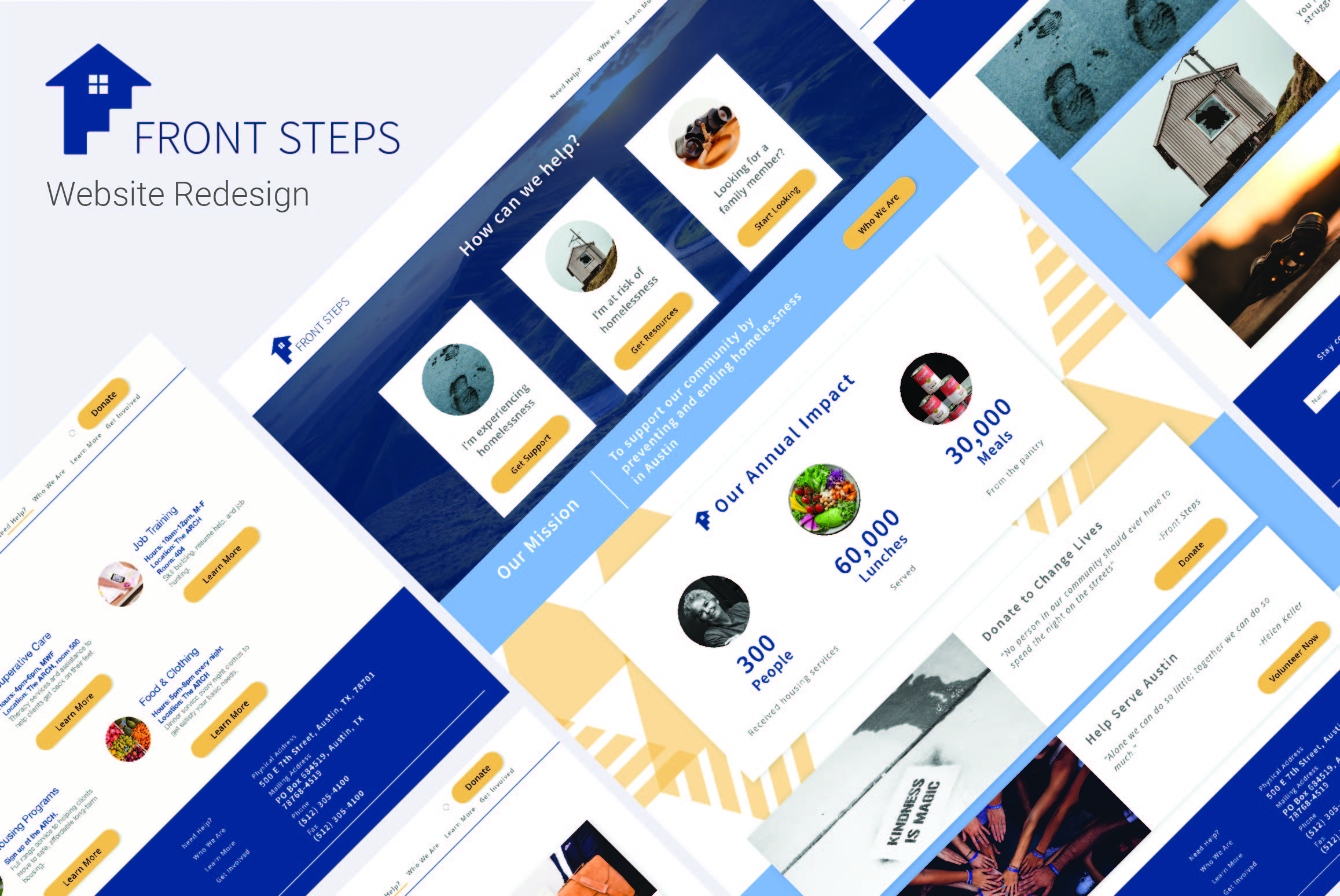
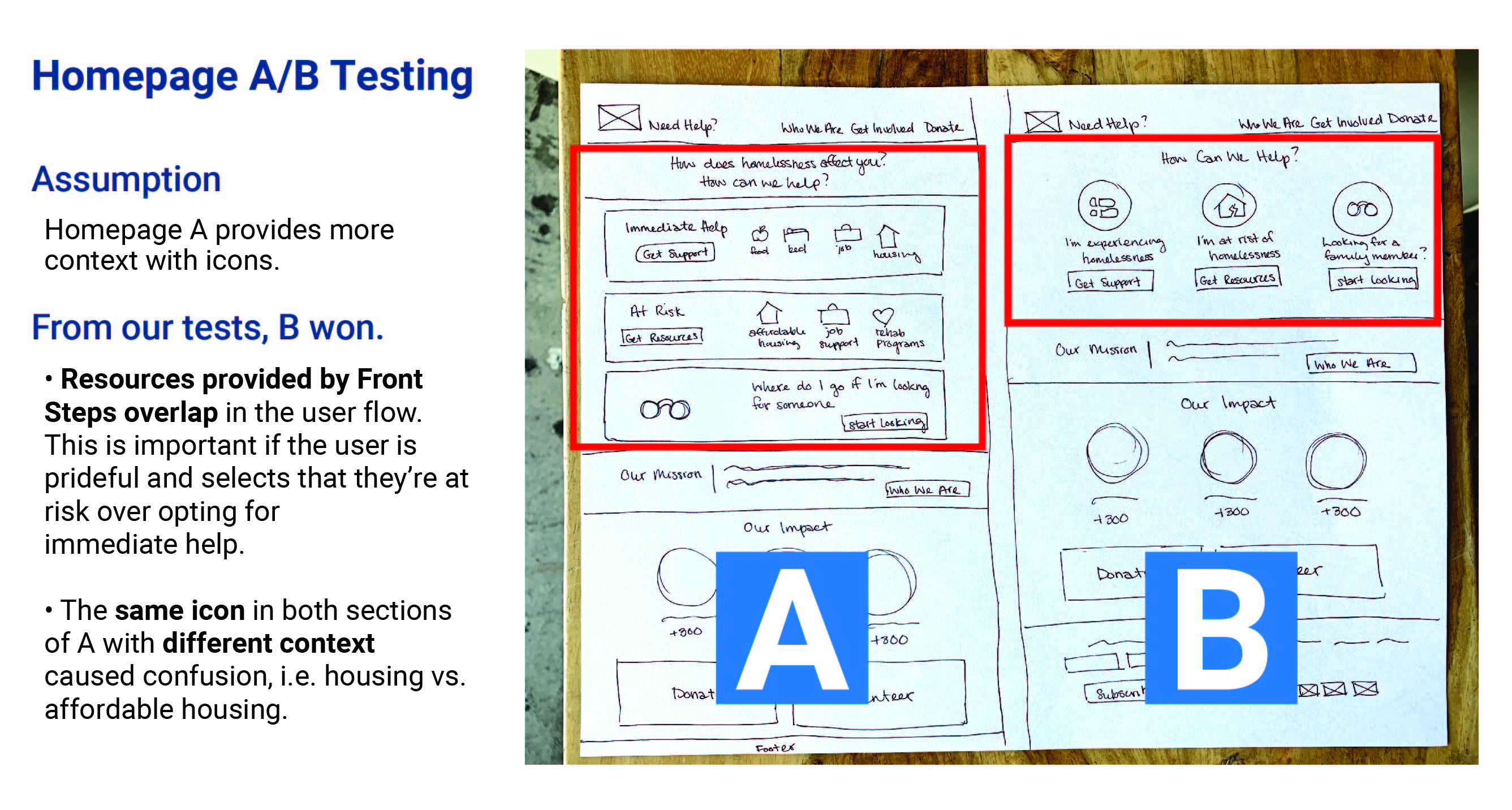
Sketches
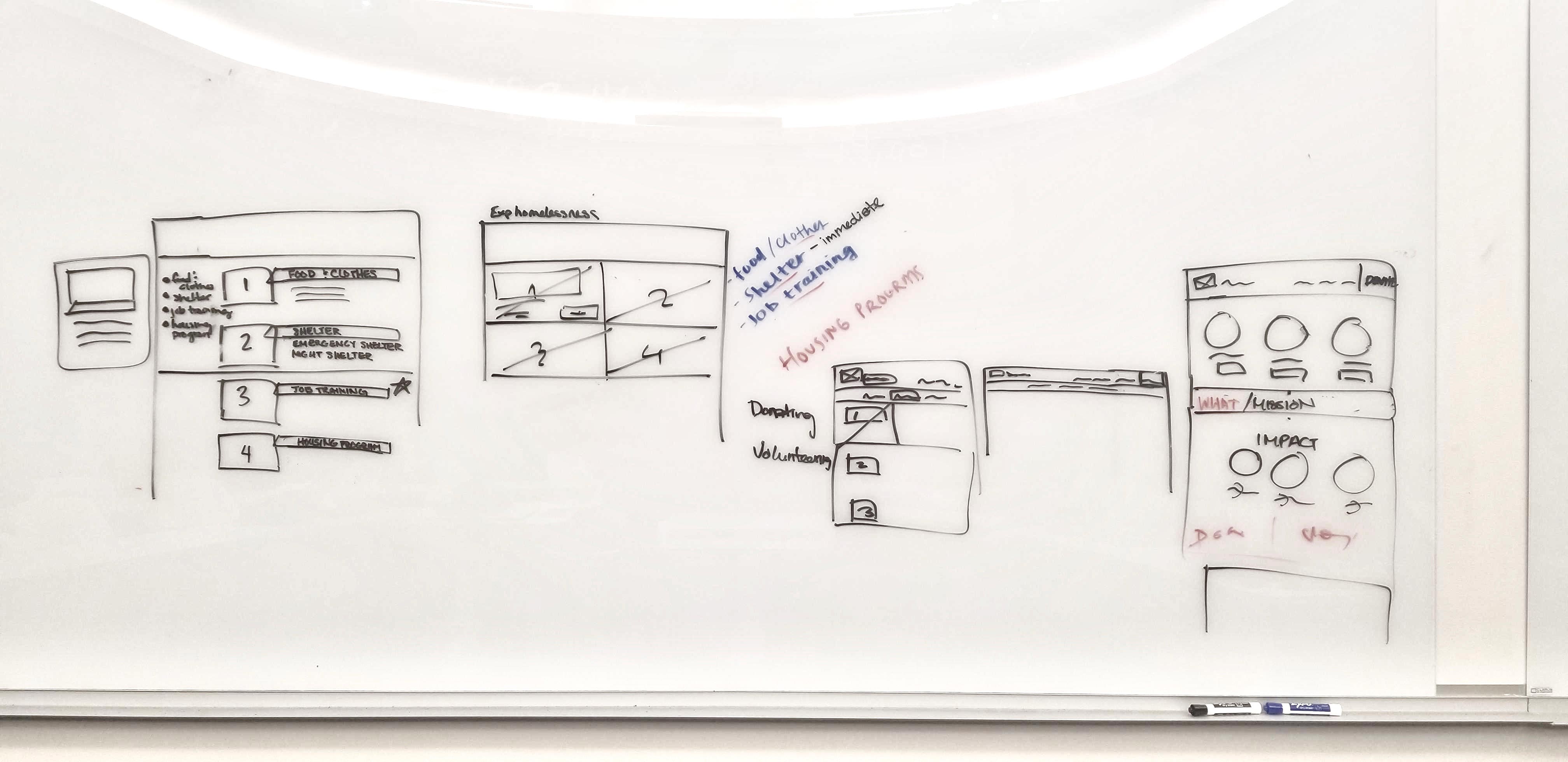
We referred to other non-profit sites as inspiration before sketching. We ended up with two homepage designs, an immediate help page, and a job training page that reflects our user flow. In order to move forward, we conducted an A/B Test on the homepage.
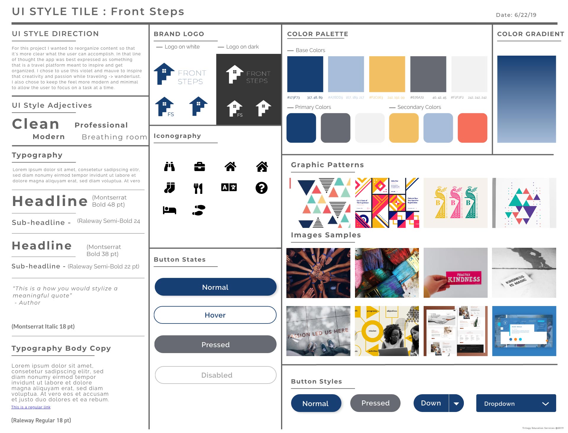
Branding
Before transitioning to hi-fi, I created a style guide. I used a minimal color pallete to keep things simple and clean as requested by our stakeholders. Additionally, I selected respectful imagery that's symbolic of the context.
Testing & Improvements
In the next iteration, guerilla testing helped us understand where the gaps were.
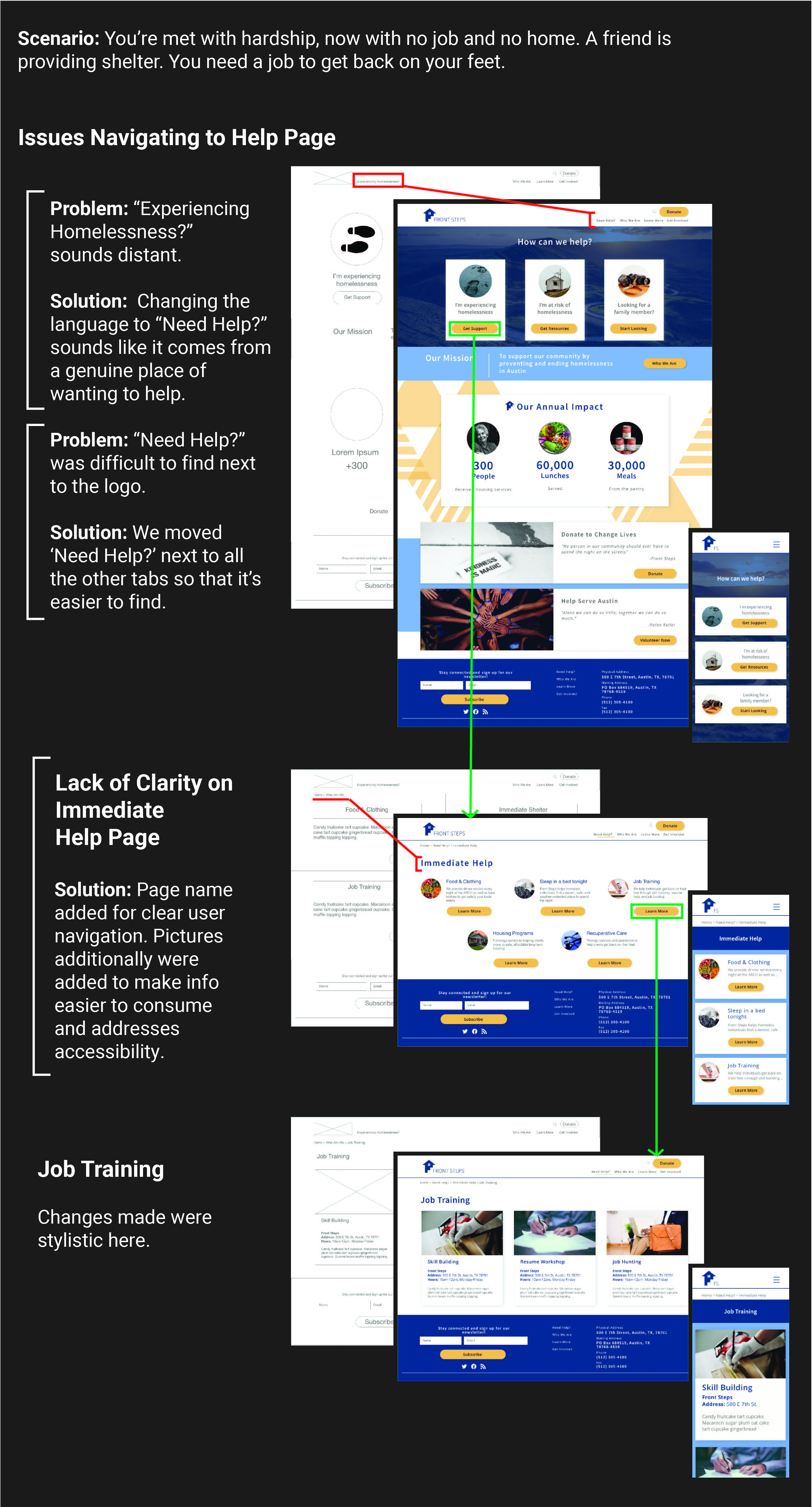
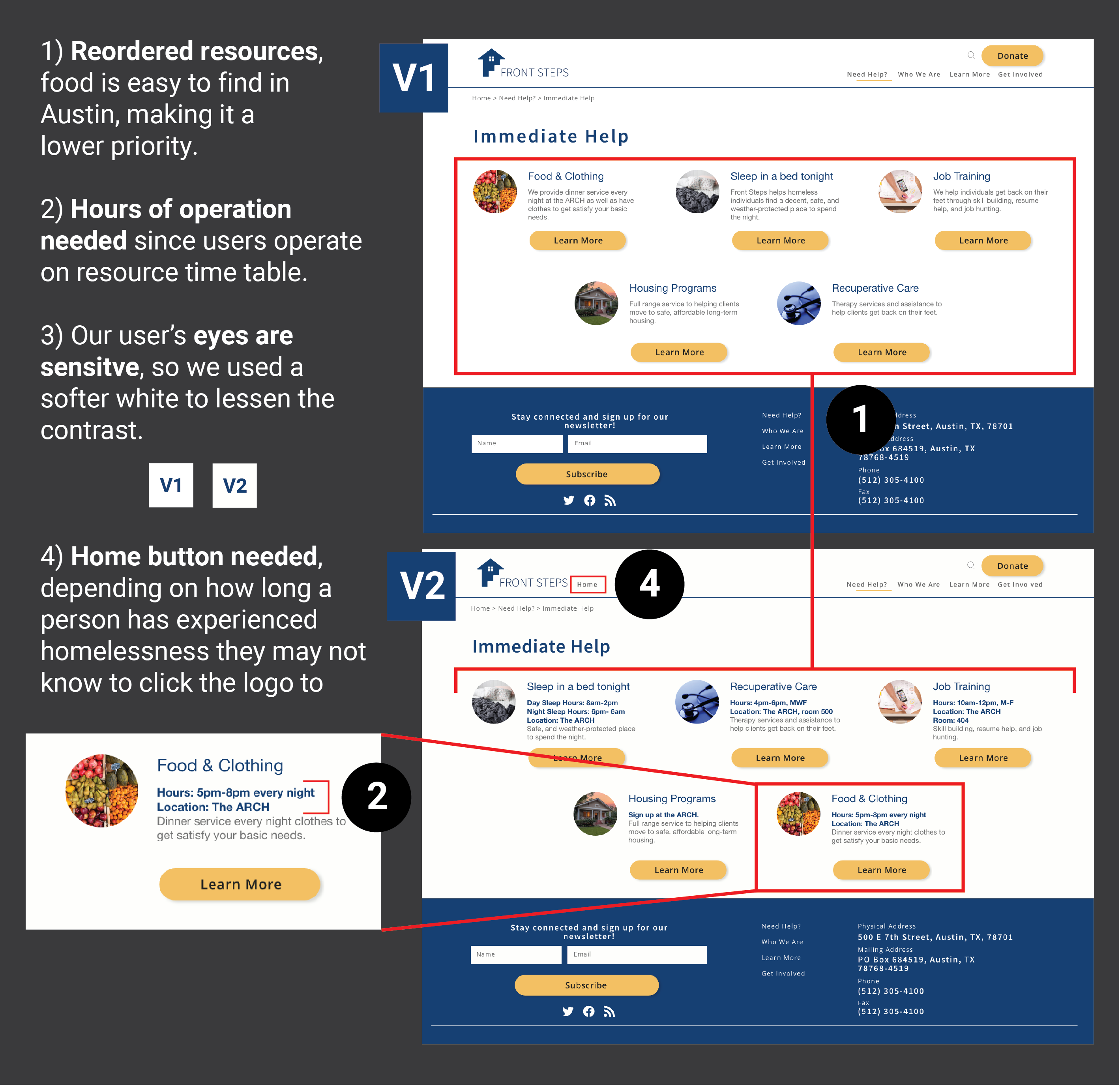
We had one more round of user tests and wanted to get a representative user. Luckily, we found someone at the downtown library. He provided the most valuable feedback by shedding light on our user’s mental model.
RESULT
 View Desktop Prototype
View Mobile Prototype
View Desktop Prototype
View Mobile Prototype
Final Thoughts
- In this redesign, we helped Front Step realign with their organizational goals that will ultimately impact future funding. Good work is well recieved, especially when it's transparent. It speaks to a donor's trust in an organization.
- What’s not showcased here is scope creep. We designed more screens in hopes of helping Front Steps realize their vision.
- This was a difficult project because there are a lot of unknowns with homelessness. A lot of footwork and research were necessary to understand a mental model that’s not as well understood.
- The next logical step is to see if there's a need for a visual time table to address our users' daily cognitive load.